Critique Thread

DeletedUser100345

Guest
@Lucario I don't really have anything to say about the first one aside from the fact that the lighting comes into the sig at the wrong direction and some of it needs sharpening. As for the second one, the texture of the smudging needs to be sorted out a bit. Try smudging lightly on high strength with different brushes and see what kind of texture you can create. It's still a pretty good sig though. They're not as good as some of your other stuff, but I can appreciate the fact that you're trying out different things with every sig, which is cool *insert skype (sun) emote*.

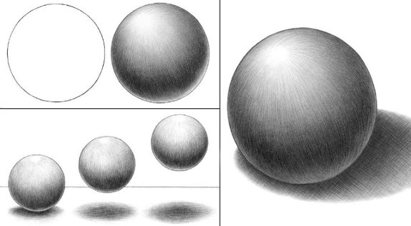
@Hardcore I think I can see clearly where you have used the dodge/burn tool in that. You should probably use a bigger brush. Also, with the circle, shadows don't really work like that. The light wraps around the object, so it wouldn't go from light to dark. It would go from light, to dark and then a little bit of light at the other side. Like in this image here:

[spoil]
b11.jpg
[/spoil]

I like the plaque at the bottom though.

thx I will try to improve this ;-)
 

DeletedUser81336

Guest
I recognize that person for come reason... Did you use that render before?
 

DeletedUser

Guest
Nope, I think it's been used around these forums though. I got the render from the team noob resource pack.
 

DeletedUser

Guest
gearsc.png


I was quite proud of this piece, I thought (for me) it was good. CnC please? :)
 

DeletedUser

Guest
gearsc.png


I was quite proud of this piece, I thought (for me) it was good. CnC please? :)

I really enjoy it, nice overall feel to the piece and you pulled off some nice text, incredible lighting in my eyes.

bold_colour_by_zenron-d41f55m.png


Bring it!

Awesome piece, very hard to fault. One thing I noticed fairly quickly is you have an incredible BG their but the color of the render throws it off, try grad mapping to either change render color or BG color to make it flow color wise instead of clash the two together.

page bump

Another nice one, like the BG but the render is a tad odd. Would be better if it was spoiler aswell.
 

DeletedUser

Guest
Really nice, however I can't really see what's going on in it.

elitea.png


You need to work on your lighting harb, i.e :


elitec.png


All I did was :

- Add some soft white brushing at the bottom on overlay 50%
- Add some soft black brushing around the edges at 92%
- Add some soft red brushing around the edges or the render on linear dodge at 30%
- Add a slight selective colour filter, but it didn't change the sig too much

4 layers can completely change the look and feel of your signature :)


DeletedUser

Guest
[SPOIL]You need to work on your lighting harb, i.e :


elitec.png


All I did was :

- Add some soft white brushing at the bottom on overlay 50%
- Add some soft black brushing around the edges at 92%
- Add some soft red brushing around the edges or the render on linear dodge at 30%
- Add a slight selective colour filter, but it didn't change the sig too much

4 layers can completely change the look and feel of your signature :)

[/SPOIL]

Like this?:

elite2.png


(old: )[SPOIL]
elitea.png
[/SPOIL]
 

DeletedUser

Guest
To be entirely frank with you GE I actually liked his more. :O

Accentuating the focal point using lighting was a good way of defining it as a point of interest and simultaneously gave the tag better depth and contrast. Not bad for four layers :p.
 

DeletedUser

Guest
Like this?:

elite2.png


(old: )[SPOIL]
elitea.png
[/SPOIL]

Yeah you basically did what I was trying to show you, just darkening the outer edges and lighting up your focal :)

Accentuating the focal point using lighting was a good way of defining it as a point of interest and simultaneously gave the tag better depth and contrast. Not bad for four layers :p.

That was the idea, thanks :p

To be entirely frank with you GE I actually liked his more. :O

Your opinion I suppose :)
 
Top