Critique Thread

DeletedUser104802

Guest
ehe on the top of the arc.i mean the cut portion,looks cool on the right and not so cool on left
 

DeletedUser

Guest
oow ok xD

v2 btw:
speedpaint_by_napoli_twforum-d4uqwxl.png


http://napoli-twforum.deviantart.com/art/Speedpaint-293508921
 

King Sean04

Guest
It's good but as n3u7r4l was saying the dark blue on the inside of the arch should continue to the bottom since it is a shadow. The top looks 3D then it stops harshly(?) on the left.
 

DeletedUser

Guest
Which is better?

Avvy for about a year =
A1jpeg.jpg


New contender for my avvy =
Greensonic.jpg
 

DeletedUser92094

Guest
Greensonic.jpg


This matches your "In-Game Staff" text around the avvy, but not your signature..
 

DeletedUser81336

Guest
Blue one, if the green one was brighter I'd say that but it doesn't match your title color with the shade it currently is.
 

DeletedUser

Guest
UAtag.png
Bit out of practice but looking to get back into gfx, critique please?
 

DeletedUser104802

Guest
lol seriously it looks like a car sticked to a wall ,and also like a car coming from a huge tide....I dunno i feel many ideas seeing it,But nice work,The tires cud be worked out more
 

King Sean04

Guest
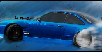
I was bored today so I fiddled around with some stuff and this is what I got

newtag.png
 

DeletedUser105413

Guest
little pagebump xD

1
i don't like the clipping mask at the left
flares at his helmet are a bit too much
colors are cool, great job making this tag not mono with these colors

2
text isn't really good and again, the flares are too much
other fx is cool, the atmo is great and the smudge is good as always
 
Top