BOTG III; Round 1 - Loading . VS jamesanddelo2

Vote for your favorite!


  • Total voters
    25
  • Poll closed .

DeletedUser

Guest
Welcome to BOTG III; Round 1.

Loading . VS jamesanddelo2

Rules
Participants cannot vote.
Keep it anonymous.

Vote for your favourite!

1.
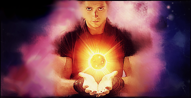
Untitled-35.png


2.

oazuo7.png


Good luck to both participants!​
 

DeletedUser102804

Guest
1 - Lighting is unnatural and it's lacking in depth. The background is quite bland as well.

2 - Lighting needs work, doesn't seem natural. Effects are everywhere and there's not much flow going on in it. Over-sharpened as well.

Voted for 2
 

Undead Billy Mays

Contributing Poster
Reaction score
294
Was torn on these two but voted for 1 based on presentation - Could use a little improvement of course but overall 2 looked very drab to me with those colors and just didn't pop.
 

DeletedUser

Guest
1 - Lighting is unnatural and it's lacking in depth. The background is quite bland as well.

2 - Lighting needs work, doesn't seem natural. Effects are everywhere and there's not much flow going on in it. Over-sharpened as well.

Voted for 2

Your still here! I thought you left for the UK forums? Kekeke.

Anyways Why'd you vote #2 when You had more points against it? Aah I know, to kill out competition? ;D Jk...NOT


---------------------------------

1. Looks way more pleasing.
 

DeletedUser102804

Guest
Your still here! I thought you left for the UK forums? Kekeke.

Anyways Why'd you vote #2 when You had more points against it? Aah I know, to kill out competition? ;D Jk...NOT


---------------------------------

1. Looks way more pleasing.

I'm perfectly capable of frequenting more than one forum hahah.

This is just one of five or six that I visit periodically throughout the day.
 

DeletedUser

Guest
1 - Lighting is unnatural and it's lacking in depth. The background is quite bland as well.

2 - Lighting needs work, doesn't seem natural. Effects are everywhere and there's not much flow going on in it. Over-sharpened as well.

Voted for 2

I agree with you entirely about the second one, definitely over sharpened and with a render like that it's become very messy.

With #1 though I would say the smudging gives it some depth as it partially covers him, arguably the ball is in the wrong place though as it doesn't seem over his hands I suppose. And I think the background is rather pretty with the colours and the smudging, the smudging could have been directed to give it a little flow but it's nice imo :p

That's why I voted 1 anyway.
 

DeletedUser

Guest
I voted for number 1 because I thought it was easier on the eye. Number 2 is quite chaotic and makes it difficult to see what is going on properly.
 

DeletedUser

Guest
I really don't like the OTT smudging in #1, let alone the source material of one of the worst movies of recent years. Due to the (poor) composition, I find my eye drawn to the top left corner, the balance is way off.
#2 seems too busy, but I like (some) mech style stuff, it gets my vote by process of elimination.
Neither of these seem particularly good to me, I hope the winner can step it up for the next round.
 
Top