Critique Thread

DeletedUser

Guest
New signature: (see my sig :3)

Dunno what to add, it's really basic yesh, but well.. kind of like it anyway.

Edit:

Vector or Ichigo?


I know they're both not that great but w/e.
 
Last edited by a moderator:

DeletedUser

Guest
I think the ichigo one is better. Could do with some soft brushing and getting rid of that clipping mask underneath the text though.
 

DeletedUser

Guest
Just made this one. Any CnC will be appreciated. I'll do what needs to be done to improve it.

11cgqb5.jpg
 

DeletedUser

Guest
11cgqb5.jpg

11cgqb5.jpg


I dont really see what you did ?

You need to sharpen that guy up and blur the background, this sparks/bubbles could do with a slight blurring.
Then ( how I do my lighting sometimes ) grab a large brush like 250px, brush black round the edges, make sure you brush outside of the canvas so just some of the black comes in abit like a shadow. Then brush white just a click or two just outside your canvas so that its shining in, and set it to overlay. If you need to reduce the opacity till it looks natural.

Try that.
 

DeletedUser

Guest
Thats better, now you've drawn attention to the man and shut out the edges of the canvas. I like it :)
 

DeletedUser

Guest
Another one. I wasn't sure where to put the name. Any ideas ?

91j4a8.jpg


Other version:

5ocrjo.jpg
 

DeletedUser

Guest
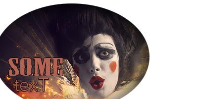
i would have put the text here if or far upper right
[spoil]
91j4a8text.jpg
[/spoil]
 

DeletedUser

Guest
Your focal is too centered, thats why your struggling to find somewhere to put the text.
As a rough guide, use the rule of thirds. But remember you dont HAVE to stick to it in every signature you make, but it is helpfull.
 
Top