DeletedUser
Guest
Lucario's Showroom 
Tuts:
Daft Punk
Stalker
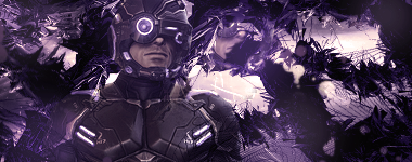
Hang Up You Fool!


(i know this one is kinda a fail)


followed a epic tut here

Collab With Zenron
[spoil]finished collab with zenron :O
my part:
[spoil]
 [/spoil]
his part:
[spoil]
 [/spoil]
finished tag:
[spoil]
 [/spoil]
thank you too zenron for collaborating ![/spoil]


Tuts:
Daft Punk
Stalker
Hang Up You Fool!
(i know this one is kinda a fail)
followed a epic tut here
Collab With Zenron
[spoil]finished collab with zenron :O
my part:
[spoil]
his part:
[spoil]
finished tag:
[spoil]
thank you too zenron for collaborating ![/spoil]
Last edited by a moderator:


