Critique Thread

DeletedUser

Guest
Looks really low quality/distorted? Also don't think the text works there, and is a bit too... bold.

harbooo.png


Edit:
harbbbb.png


CnC on these two pl0x? :)

no.1:
those splatters on a lowered opacity are killing the deoth :/ clipmask an applied image into it :D
also, the render is blurry :( other than that, there good :icon_razz:

no.2:
overlayed text :/
kill that random brushwork.
and rounded border doesnt look good :(


cnc plz :icon_razz:
avatarle.png

i got up to my most layers yet :O 47 :p
 
Last edited by a moderator:

DeletedUser

Guest
Nice lucario, the only thing that doesn't work is the light source and the thing on the left. Nice work on the background though.
 

DeletedUser

Guest
You need more light coming onto the left side too. And maybe some random green spots on soft light. I would try to help you but my photoshop is f'd up. I'm trying to fix it x.x
 

Burning GFX

Guest
Oh wow, I leave for a few months and everyone is pretty good now. D:

Edit:
The splashes in the background blend into the shirt slightly. Colors on the text is similar to the entire signature, why have such small text? :eek:

BOBA are you teh one i knew or the one who i always got confused with the one i knew D:<
 

DeletedUser

Guest
Too much white space, it also appears to be LQ in a lot of places. Too much text too. But it kinda flows I guess :p
 

DeletedUser

Guest
I don't think it looks LQ or have two much space RSI :p

Maybe just my shitty comp not displaying the image well :(
 

DeletedUser

Guest
Dont get me wrong, it doesnt look to bad at all :) I am just pointing out what I see and what could be done differently next time if they wanted... The white light surrounding the render blends with the render too much it makes is chaotic ad the c4d's look rough (lq) due to the layer blending, it doesn't help colouring...
 

DeletedUser81336

Guest
UKC I'll give you a CnC tomorrow when I can think better. :D
Btw I am a big fan of your current signature lol.
 

DeletedUser

Guest
@Lucario I don't really have anything to say about the first one aside from the fact that the lighting comes into the sig at the wrong direction and some of it needs sharpening. As for the second one, the texture of the smudging needs to be sorted out a bit. Try smudging lightly on high strength with different brushes and see what kind of texture you can create. It's still a pretty good sig though. They're not as good as some of your other stuff, but I can appreciate the fact that you're trying out different things with every sig, which is cool *insert skype (sun) emote*.

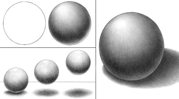
@Hardcore I think I can see clearly where you have used the dodge/burn tool in that. You should probably use a bigger brush. Also, with the circle, shadows don't really work like that. The light wraps around the object, so it wouldn't go from light to dark. It would go from light, to dark and then a little bit of light at the other side. Like in this image here:

[spoil]
b11.jpg
[/spoil]

I like the plaque at the bottom though.
 
Last edited by a moderator:
Top