You are using an out of date browser. It may not display this or other websites correctly.
You should upgrade or use an alternative browser.
You should upgrade or use an alternative browser.
DeletedUser
Guest
This piece took me like 2h30m but it's finally ready,the background is made completely from duplicates of the render and smudging work...")

(it looks better on a darker background)
Here's the render:http://sneakybaron.com/albums/FTP_uploaded/Sensational_Spiderman_1.png
(it looks better on a darker background)
Here's the render:http://sneakybaron.com/albums/FTP_uploaded/Sensational_Spiderman_1.png
DeletedUser
Guest
nice amorphous purple blob you got yourself there
on a more caring note i can tell that you were completely tunnel visioned, try to avoid that
on a more caring note i can tell that you were completely tunnel visioned, try to avoid that
DeletedUser
Guest

It's a bit plain, but...
DeletedUser
Guest
nice amorphous purple blob you got yourself there
on a more caring note i can tell that you were completely tunnel visioned, try to avoid that
Thanks and I was what?:icon_confused:
DeletedUser
Guest
Made zis from a tutorial again

DeletedUser
Guest
@Law A little more blue would do well in this sig. Most of it is monotone at the moment.Other than that I quite like it.
@harb The focal point is way too big for this sig, it takes up most of it. You need to incorporate more of a person if you're going to get into the higher levels of sig making. Right now it has what we call "Floating Head syndrome".
@Nubz The tutorial maker is making you do stuff which isn't exactly right again Beckie. The clipping mask squares on the left side break up the flow and the colours of the render and the rest of the sig don't work well together.
DeletedUser
Guest
@Nubz The tutorial maker is making you do stuff which isn't exactly right again Beckie. The clipping mask squares on the left side break up the flow and the colours of the render and the rest of the sig don't work well together.
I disagree on both counts >< but thanks
DeletedUser
Guest
Well then you would be wrong those bars ruin the signature ...
those bars ruin the signature ...DeletedUser
Guest
I posted this to Nubz on skype but I thought I may as well post it here as well, someone else may find it useful:
The main objective to flow is to lead the viewers eye into the sig, through the most important aspects of it, and then out again. Currently in your sig, we can see a clear upwards and outwards trend, which would generally work just fine, but the presence of the clipping mask boxes stops the viewers eyes from naturally flowing upwards and out of the sig. Our eyes automatically stop at these points. Breaking the flow can be used well, but it hasn't been here. You see, breaking flow creates conflict within the sig, and the eye is drawn to this because it is different. But, in your sig, the conflict is created in a fairly irrelevant part of the sig, away from the focal. So they would do well being replaced with something else.
The main objective to flow is to lead the viewers eye into the sig, through the most important aspects of it, and then out again. Currently in your sig, we can see a clear upwards and outwards trend, which would generally work just fine, but the presence of the clipping mask boxes stops the viewers eyes from naturally flowing upwards and out of the sig. Our eyes automatically stop at these points. Breaking the flow can be used well, but it hasn't been here. You see, breaking flow creates conflict within the sig, and the eye is drawn to this because it is different. But, in your sig, the conflict is created in a fairly irrelevant part of the sig, away from the focal. So they would do well being replaced with something else.
DeletedUser
Guest
So this is better?

DeletedUser
Guest
much better
Critique please? First tag in a while
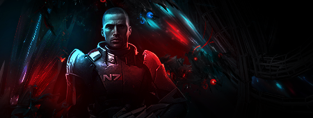
V2
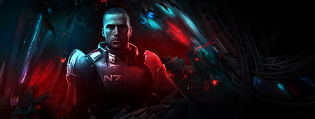
Critique please? First tag in a while
V2
Last edited by a moderator:
DeletedUser
Guest
Better Add some text ?
Add some text ?DeletedUser
Guest
Think I might, some naughty glowing red or cyan might do the trick.
DeletedUser81336
Guest
*rips RSI's sig*
DeletedUser
Guest
*Rips Oscar*
DeletedUser
Guest
 .
.DeletedUser95815
Guest
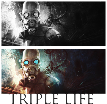
Awesome as always. Funny, just been looking through your showroom)
Maybe add a bit more blending.
Maybe add a bit more blending.
DeletedUser
Guest

Anyone have any ideas for improvement? It needs something more, but I can't think of what.
DeletedUser
Guest
As you can probably guess, I'm new to Graphics
I made this piece using a tut..
[spoil]
 [/spoil]
Any CnC?
I made this piece using a tut..
[spoil]
Any CnC?
Share:
