Critique Thread

DeletedUser56488

Guest
Any CnC :)
SOTW80px.png
 

DeletedUser92094

Guest
Why so small, eh? :s
makes it hard to see properly, but when i quint my eyes and focus..
i can see it is a brilliant piece, with some cool looking effects.
just make bigger. c;

CnC 'dis mah dawgz!

iamepic.png
 

DeletedUser

Guest
Everything lol
I like the stock or render? haha im not sure what its called and I like the paragraph of text instead of just one word, I think it suits the piece
 

DeletedUser92094

Guest
thanks:)
i'll tell you the difference between a stock/render.

Stock;
[spoil]
girlforrequest.jpg
[/spoil]

Render;
[spoil]
GirlRender.png
[/spoil]

Basically, a render has no background, or is transparent.
and a stock has a background.

get me?
 

DeletedUser

Guest
Wrong :p

http://en.wikipedia.org/wiki/Rendering_(computer_graphics)

Oh, and from the .uk server


[spoil]
Cut-outs are cut-outs and renders are renders.
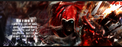
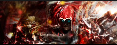
Render
Renders are computer created artworks, generated by (3D modelling) software. Usually a user creates a scene and the software adds light, reflections, surfaces, shadows and so on.
Cut-outs
If you have an image, and you are cutting out a part of it, it's a cut-out. You may change backgrounds or any other unwanted item of an image by cutting out the wanted part and replacing everything else.
Please, we have some skilled artists using these forums. Don't follow the "Evil path" of some GFX forums and use the wrong terms here. A cut-out image isn't a render. "Planetrenders" was one of the worst ideas ever in terms of spreading wrong definitions. Try to use the correct terms. Renders and cut-outs are two totally different things.
[/spoil]

But for the main bit, I was just being picky, you are mostly right for what people use as terms :)

[Even GE uses it wrong :S]
 

DeletedUser

Guest
Uhhh....text doesnt work :S

Don't try and constantly work the small, readable text, and make the colours match

You are improving well though :)
 

DeletedUser92094

Guest
yeahh, i couldnt really find a text that suited it. D:
and it looked so poo'ish without text..

but i like the small text. :(
 

DeletedUser

Guest
lol Ok.. im still confused o_O
yeah I like the small text to although I don't really like the light thingy behind it lol

I made this piece using a tut:
[spoil]
tyopgraphyface.png
[/spoil]
Its meant to be typography
 

DeletedUser92094

Guest
aha, don't worry about it, not real important.
and yeah the light thing, i completely forgot to fix. :s

i'll tinker with it soon.

You should crop the image so there isn't so much space around the typog.
 

DeletedUser92094

Guest
much better.

ok so i fixed up that piece i made, edited text.
changed some colours, fixed the light source.
tell me what you think?

iamepic2.png
 

DeletedUser92094

Guest
i think it's much better, i fixed it, and made the focal point, well the focal point like it should be.
light source looks effective.
and the colours are much better now. :)
 

DeletedUser

Guest
Better then the first Normy but I think with the render your using it would look much better with a simplistic type backround. Ive found that to be true with almost all AC renders.

/AC is god.
 

DeletedUser95815

Guest
Bit to over contrasted and over sharpened imo. The others have been good though.
 
Top