DeletedUser
Guest
and could somebody give me a good quote to put in there...

")

CnC?
Any CnC please

What i like: The background.
What needs improving: Less red, and better lighting.
and ill try taking my gradient maps off it


Im out of ideas what can i add to this :
[spoil][/spoil]
Hummer, you're making your signatures too wide, and slightly too high.
The whole render does not have to fit the signature either.
I know you are new to the art of GFX, so i advise following a few tutorials.
Some serious CnC please?!

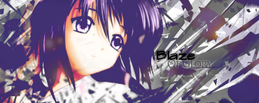
What I like: The lighting, colour and the text surprisingly works.
What needs improving: I think you have darkened the right side of her face a tiny bit too much, and that blue smudge coming from her earing seems out of place and very "anti-flow". Also, the black in the top right is just pure black, not just darkened, I think it would be better to have some kind of background there, but darkened. It's particularly noticeable as-well because of the direct white stripe next to it in the bottom right. Against the pure black as-well you can see that it is a render pasted in, the left side has depth however the right side feels unfinished.

I love how norman is the only one who gives any CnC in return.
go ;-)

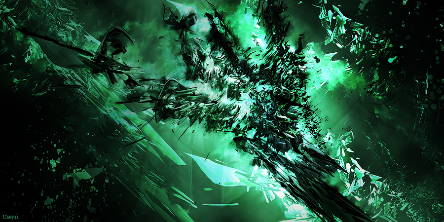
What I like: The splatter effects. Very good blending, it really fits well.
What needs improving: A more clearly defined focal, I was confused about where I was supposed to be looking, which is especially bad with a vertical sig, also the background seems quite plain, it's just a gradient. It all feels quite unfinished. Also more defined lighting, it's not really good to have black in the middle like that, and the outsides lightened, it automatically splits focal.
Did it for my gf :icon_razz: