DeletedUser104802
Guest
While I'm here, let's show some of my latest tags


Theyre AWESOME!
While I'm here, let's show some of my latest tags

If your wanting to do a typo piece, make sure you do a lot of work on the text. Currently the text is the focal, but the bg is very busy and a bit random. If your doing typo, make sure you do something distinctive with the text not overwhelmed by the bg etc.
________________________________________
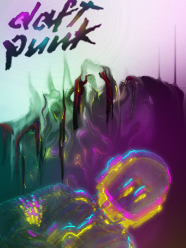
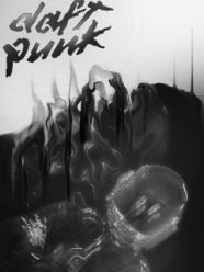
Can't remember the last time I made a tag. Anyway, I decided bosh something together tonight, I'm pretty rusty :')


") at the moment its cool, just you've undone a lot of our work by adding the rough smudges ontop, smudge tags tend to look nice with sharp definition; like you had before nice work bud :3
at the moment its cool, just you've undone a lot of our work by adding the rough smudges ontop, smudge tags tend to look nice with sharp definition; like you had before nice work bud :3
hello TWGFX nerds!
i see you haven't learned how to make decent tags
is here any good premade for w63?

[SPOIL][/SPOIL]