Critique Thread

DeletedUser

Guest
^^^
remind me on this
NGtextTWUKback.jpg


not bad at all, i like what you did with pen tool. just fade reflection a little.
or you can add waves on reflection and make it look like on water...

Good thinking, never thought of that. I cant read what it says towards the end on yours.
 

jaysizzle

Guest
Nightbladesiggy.png

Ok maybe not as awesome as snowmans but i want some CnC.
btw snowman my GFX eyes cant find anything wrong with your sig nor anyway to make it better except right side is abit empty in the bg and the text (Not watermark tet the other one)
 

DeletedUser

Guest
Rauly, blend renders please.
immortalsoul.jpg


Can you not see how plainly that sticks out?

Oh and the text is pretty unfitting. =]

Other than that, great. 7/10.

Kthxbai
 

DeletedUser

Guest
Another

Sigh...

DafCom2.jpg

Don't see why you sighed, it's a good sig. The background and placement of the render are good. Maybe remove the smudging around the fingers?

Nightbladesiggy.png

Ok maybe not as awesome as snowmans but i want some CnC.
btw snowman my GFX eyes cant find anything wrong with your sig nor anyway to make it better except right side is abit empty in the bg and the text (Not watermark tet the other one)

Still, it is pretty awesome. Maybe make the text stand out a little, and the render more? <3 the smudging in the background.

Rauly, blend renders please.
immortalsoul.jpg


Can you not see how plainly that sticks out?

Oh and the text is pretty unfitting. =]

Other than that, great. 7/10.

Kthxbai

I think he has the render pretty spot on. Maybe the blue stripe needs to be coloured to suit the rest of the sig.
 

DeletedUser

Guest
I think he has the render pretty spot on. Maybe the blue stripe needs to be coloured to suit the rest of the sig.

On the render, do you see the yellow-ish outline which probably came from the original stock? It makes it stick out. Needless to say, blending is a just a good practice anyway.
 

DeletedUser

Guest
Yeah ty is right it needs blenidng into the bg via smudging or rubbing out the sides or something
 

DeletedUser

Guest
I think the yellow suits :L
Anyway, isn't that the lighting?
 

DeletedUser

Guest
I think the yellow suits :L
Anyway, isn't that the lighting?

Nooo, the lighting comes from behind him. The yellow borderline is embedded into the render, probably because the original stock that it was rendered from had some yellow effect surrouding it.
 

DeletedUser

Guest
please cnc this, its for that contest thing (ignore the watermark in the corner)

This is my first stock attempt.

Original Stock
[SPOIL]
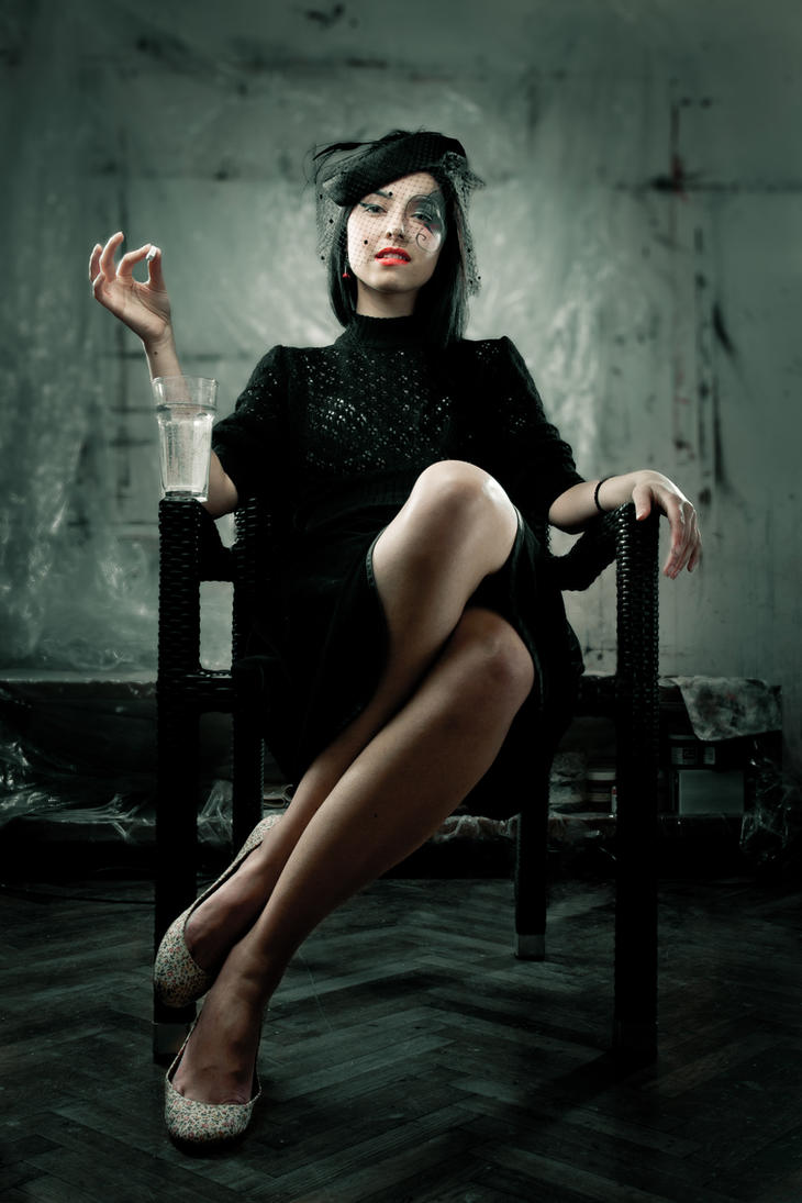
Professional_widow_by_xn3ctz.jpg
[/SPOIL]

contestb.jpg
 

DeletedUser

Guest
hmm idk what its is but i think its quite nice, it doesn't look like you have used outstanding effects but i find it quite mellow and warm lol. Hmm yh thats all I can really think to say :lol: but anyways gd work :)

cnc this please?
summerlovincopy.png
 

DeletedUser81336

Guest
Well I don't really know what to say. In my opinion it's very good, but I suck at graphics. :D
I can't really tell what's by his (or her) mouth it looks like the top of a toothbrush though? Anyways the line you added to to the top is ok but I think it might be better if you just cut the signature off there, maybe...

Anyways could someone CnC this please?

SomeOwlThing1.jpg
 

DeletedUser

Guest
Suck at graphic you say? I beg to differ, I think you have improved a lot imo since i first got here.

I love the way the bg fits in with the image, the mystical look to the image is also nice. The only thing I would say is that there is a lot of attention drawn towards the wing above your text, maybe due to the lighting, not sure if that's the focal you were aiming for. But it still looks very nice :)

Umm is this any better?

[SPOIL]
stock:
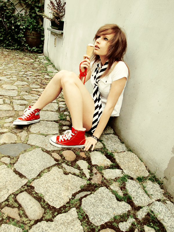
i_love_ice_cream__haha__by_Klaamka.jpg


first attempt:
summerlovincopy.png


latest go:
summerlovin2copy.png

[/SPOIL]
 

DeletedUser81336

Guest
Suck at graphic you say? I beg to differ, I think you have improved a lot imo since i first got here.

I love the way the bg fits in with the image, the mystical look to the image is also nice. The only thing I would say is that there is a lot of attention drawn towards the wing above your text, maybe due to the lighting, not sure if that's the focal you were aiming for. But it still looks very nice :)

Umm is this any better?

[SPOIL]
stock:
i_love_ice_cream__haha__by_Klaamka.jpg


first attempt:
summerlovincopy.png


latest go:
summerlovin2copy.png

[/SPOIL]

Oh lol, I wasn't very observant. Ice cream cone eh?
Anyways I think they're both good now but her hair looks fake in both of them, nothing you can do there though.
 
Top