I remember that tut, never did but read it a few times. Shuya's it is, am I right?
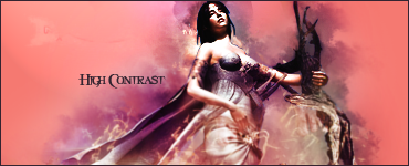
I think foreground clouds are a little bit too bright, they lose any texture on the left side.
Fiddle around with text a bit more. Font is chosen well (personally I find Luna Bar overused, but it goes well with pretty much everything), but work a bit on blending it within the sig. Definitely play with outer glow settings (or is it stroke?), make glow wider and less in less contrast with text and background. Probably make the text a one or two sizes smaller.
 [/spoil]
")