Discussion: Update to version 8.16

DeletedUser

Guest
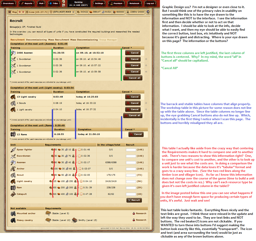
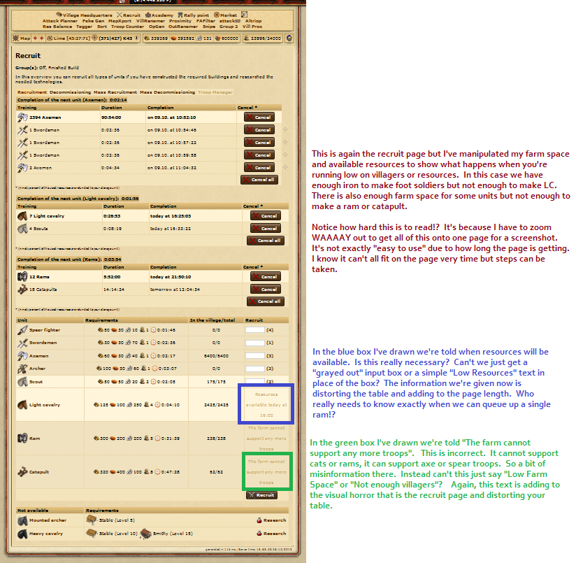
I've been reading through the negative feedback in this discussion thread, as well as on the Developer's Blog.

It's really unfortunate that these great buttons' functionality was overlooked by the (Admittedly poorly chosen) graphics. I think it would be fair to point out that The buttons' graphics were changed to make them fit in with the colour palette of the game. They used to be really bright and orange hehe.

As a student studying Computer Programming/Systems Analysis in college right now, I can't help but feel bad for the developers here. It reminds me of a couple situations I have been in... See, I can't pick colours to save my life and a few projects I've made in the past had been completely overlooked due to the poor visual appeal. People completely missed all the hard work and effort that went into the functionality of the project, all they could see were my poorly chosen colours :(

So let me be the first Penguin in the water to say great job! These UI improvements are perfectly logical and I really love the way these custom buttons and dialog boxes work. Very elegant, guys and girls! :)
 

2hot2handle

Contributing Poster
Reaction score
13
I like the graphics

People really just hate any change

I'm so glad you said this, I was starting to think the only reason I loved them was because of ...

That the changes are ..... a gross insult to the intelligence of the people that play the game :icon_confused:

:icon_redface:

I actually really love the changes. They are quite different and might take some getting used too for some, like most changes. Sometimes I hate facebook changes but you come to appreciate them with time. It's just the initial adjustment that is the difficult part.
To be honest I'm just glad there are changes occurring and the effort is being put in to develop the game further, rather than giving up on what previously many considered to be a dying game.
Some time ago I remember thinking Tribalwars wasn't going to last much longer, yet so many features have been implemented since and to remain competitive with new and current games - changes old timers don't like will inevitably occur. So we might not always have the game we were born into, as noobs, but at least there is more chance of having the game at all and hopefully forever improving.
People seem to be clutching hold of the past, that is not really going to help advance the game any. That's not to say I don't think current players should be listened too, but maybe we just have to accept the reality that changes will occur we don't necessarily initially prefer.
Having said this it would be preferable if players had much more consultation on future changes and consultation should be taken into consideration before the release of new updates .... and the color of the buttons is shit :p :)


Don't lynch me :S


DeletedUser

Guest
Hi there. Like most people I usually find new changes a little discomforting at first but i get used to them quickly and move on. I think just about everything done to the game has been an improvement and I like where things are going. I do want to address the lack of consistency and polish in the game though. Like most of you, I hate the brown buttons and consider them a step backward. I'm sure I'll "get used to it" but I don't think I'll ever like them.

I've drawn up a couple screenshots from the absolutely worst page to look at for me since the update. Some of it's problems have been going on since long before this update. The addition of the new buttons though just makes this page especially bad and unprofessional looking.

It's the recruit page. What a mess. You can look at my screenshots and notations below and see if you agree/disagree. If a Gaming website were to write up a review of this game, you can almost bet there will be a screenshot of the graphical village overview and very probably a screenshot a lot like the one I'm posting below. The phrases "lack of polish", "inconsistent", "ugly", and "not user friendly" would probably be used. I'm almost positive such layouts would knock you down a point or three on a 10/10 ratings system.

[spoil]

Recruit1.png

[/spoil]

[spoil]
Recruit2.png

[/spoil]

I noticed since making those images that the VHQ lays out resource requirements in a nice table rather than mashing them all together and then centering like the recruit page does. So I know it's possible!

Most of us diehards would probably sit in a chair full of broken glass staring at an 8" monitor if that's what we HAD to do to play Tribal Wars. We like the game and the concept! The presentation needs work in order to attract new people and improve usability. I probably could do a similar screenshot of a lot of different pages in the game and give my comments, but that's not really my job is it? Innogames pays people for that. I just wanted to bring one of the uglier ones to light and hopefully explain some of the ire that people have in this thread.

Thanks.
 

DeletedUser106579

Guest
...Sometimes I hate facebook changes but you come to appreciate them with time...

Probably not a great example when Facebook is haemorrhaging users..

People seem to be clutching hold of the past...

It's not really about rose-tinted nostalgia - I'm not even sure how many upgrades there have been in the past year but most seem to pass by without a mention apart from some script clashes. However, some aspects of this update have diminished functionality, as pointed out by numerous players (increased scrolling for one), and since the 'upgrade' there have already been certain cosmetic changes where the implementation was especially poor. But if one of the prime intentions was to reduce clutter and complexity then the whole thing has to be considered a fail.

The colour scheme is a massive 'meh' for me - I'm not keen but it's a matter of taste. But the need to spend twice as long in the HQ every day, because the tables have ballooned to a monstrous size so that scrolling is unavoidable, surely can't benefit anyone, whether they're a newcomer or old-timer...

Having said this it would be preferable if players had much more consultation on future changes and consultation should be taken into consideration before the release of new updates....

I think that's what this thread is about. Make changes. 'Enhance' the game. Have a gruff axeman (paperclip?) in the HQ offering advice on how to build the ultimate villa. But at least give people the option to stick with something that's clearly more efficient. So, in the next 'upgrade' (or sooner) offer the 6.5 setting. I've mentioned I didn't use it before but I would now...and I'd be prepared to pay a little bit extra for it.

...and the color of the buttons is shit :p

LOL
 
Last edited by a moderator:

DeletedUser106579

Guest
I know...:icon_sad:

But since Inno seem to be steadfastly ignoring all the calls for the 6.5 option to be reinstated (even though the alignments and button-colour amendment can be done within the space of 24 hours), maybe that's what it'll take.

Not wishing to cast aspersions on Inno's motivation for creating that HQ horror-show, but using AM is one way around having to experience it...

And money talks.
 

DeletedUser

Guest
If you want a company to stop doing something then you have to deprive them of money; not throw it at them.
 

DeletedUser106579

Guest
If you want a company to stop doing something then you have to deprive them of money; not throw it at them.

Rarely works, since it's almost impossible to get enough people to boycott, and even if you can, companies tend to shrug and go exploit a different market...but I see your point.
 

busamad

Contributing Poster
Reaction score
34
I still do not understand why the large blobs are needed and why they are on the none graphical format page.

Maybe if you explained that I could try & warm to the idea of only being able to view a couple of pages before my eyes hurt.
 

DeletedUser656

Guest
We will be improving the interface based on user feedback in the coming week(s). We already made some small changes based on the feedback here, such as slightly smaller buttons, adjusting the colours to match the game and improving the alignment of some elements. The current button matches the colours already used in the context menu buttons and farm assistant. However, the colour will likely be tweaked with a little more to make it a warmer shade of brown, and hopefully reduce the size of the buttons a little more.

Our focus immediately after the update was more on fixing bugs affecting gameplay which we prioritised over making further changes to the UI.

In general it's very hard to ask players for feedback before making changes because often the goals of players differ to our goals, and because it's impossible to get a balanced point of view from the forums. Those who frequent the forums are usually hardcore players who have been playing the game a long time, and while your opinions are valued, this category represents a very small amount of our player base. It can sometimes be hard to explain the decisions behind changes too. When designing an online game sometimes you spend weeks tweaking the tiniest things or extensively A/B testing (showing different screens to groups of players to see what performs better). This is just one example, but isn't something we could expect anyone other than our development team to really care about.

However, we do have the beta servers which usually runs new versions of the game for at least 2 weeks before public release. If you'd like to be consulted on changes or give feedback prior to release, please do head over there and provide feedback on the beta forums.

Constructive feedback is great, and there have been a few posts here we've noticed and either already have or will act on.

In short, the reasons behind the changes have been explained on our devblog. We did even mention there that we expected existing players to react negatively to the changes / take a while to get used to them. You may not agree with them, but that doesn't mean we'll revert them.
 

Deleted User - 832139

Guest
c25f736eff6bede10841661022b9013d.png


Just a heads up .. there is a slight miss alignment with the support ... seems a few px low .. (Firefox if that makes any difference)

Other than that I am accepting the new buttons more ... still think they are a little strong by overpowering the text information and do distract the eye some ... but a massive improvement on the first draft.

Also I am liking the new updates on the function side ... works well and improves game play in my eyes ..
 

DeletedUser92753

Guest
I do like that the tab headings now remind me I have incoming.
 

rascal-the-cat

Guest
I see the buttons have now shrunk some more and are a much less abrasive shade of brown. A definite step forward. Any chance of reducing the size of the X now as it looks disproportionately large compared to the overall size of the button?
 

DeletedUser656

Guest
Some changes have been rolled out today based on feedback:

- Smaller button size
- Warmer brown colour for buttons
- Fixed alignment issues in recruitment screen (example: requirements are now aligned more nicely if you have a modern browser)
- Some bug fixes
 

A humble player

Guest
The new buttons are a huge improvement.

I didn't like the old ones, but since the new ones are (more or less) the same size as the text links, its not annoying.
 

DeletedUser106579

Guest
Much better in the HQ. Looks like the building icons/graphics were put on the same 'line/level' as the text, so the cells are smaller and there's less scrolling :)
 

nowitsover

Guest
Some changes have been rolled out today based on feedback:

- Smaller button size
- Warmer brown colour for buttons
- Fixed alignment issues in recruitment screen (example: requirements are now aligned more nicely if you have a modern browser)
- Some bug fixes

The changes are appreciated. Thanks!
 

DeletedUser105718

Guest
It's probably been asked, but was there no chance to test this all out in BETA?
 
Top