Gallery of A Creative Adventurer

mattoematt

Guest
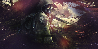
Like far side said, the stock doesnt fit in. The whole signature has this dark, mysterious feel to it, then you ruin it with these bright intrusions.
Use a black and white industrial stock or something ?

I disagree. I definitely think the light coming in adds to it. :icon_biggrin:
 

DeletedUser

Guest
gas_it__by_zenron-d3ag107.png
Very "Nausicaä of the Valley of the Wind" of you.
Or at least, that's what I thought of when I saw it. :p
 

DeletedUser

Guest
Didn't get that reference. It's probably the only Hiyao Miyazaki movie that I haven't seen :(
 

DeletedUser

Guest
I'm sure it is. Pretty much all of his movies are awesome. I downloaded his movie collection but never got around to watching a few of them.
 

DeletedUser63403

Guest
Xprophet?

Sky looks good. Dont add buildings, would make it cluttered. In all, a fine piece except for the color patch on the top left near the head which is followed by a dark patch in the middle left, makes it out of place and sticks out like a sore thumb.
 

DeletedUser63403

Guest
Try some good optical flares if you want to. Or maybe just move onto next LP... :D
 

DeletedUser

Guest
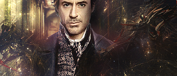
Try setting it more monotone the second one but still keep the colour. That colour on his left soldier would be a good one :icon_razz:

Left from where he is standing, or from where we're standing.
EDIT: I think he means how the focal/shoulders are covered by C4D, the black behind his ear E.T.C
 

DeletedUser63403

Guest
Explain! :( I followed the rules in the link you posted.
I will just go through the major mistakes and leave the nitpicking for you. First and foremost, the eyes, which should be the focal are almost on the border. Rule of thirds is not used, the focal point comes at somewhere around the collar/shoulder. If eyes were not meant to be the focal then shouldn't have been highligted so much. The render needs to move around 10px left. The darkened area looks blurry because soft round brush must have been used to erase the edges so that it appears to be blending in. The scarf is highlighted from top to bottom leading the attention out of the image (a point explained in the link i gave).
 

DeletedUser

Guest
Zenron! Thats a pretty awesome tag, great depth and comp.
 

nindel

Guest
Zenron you beast, that signature is amazing!!


/bows down and praises the almighty, great Zenron m(_ _)m
 

DeletedUser

Guest
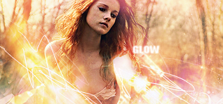
glow_by_zenron-d3kwaxg.png


Long time no post, here's a tag for you.

Your back? :icon_razz: HB for the other day btw; skype told me.
I like the tag but I don't like the composition. Some more colour would be cool too :icon_cool:
You should hang around here more often, as long as you don't keep telling lies in your avatar :icon_neutral:
 
Top