My first attempt. Please judge.

DeletedUser104020

Guest
Megatron.png
I Don't mind if you tell me whats wrong with this.
 

DeletedUser

Guest
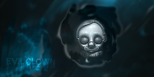
Well here we go, not bad for a first try. There's a few rules you should follow when making sigs, which coincide with photography. So I guess it works here.

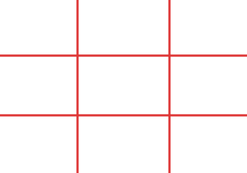
The first is placement, you want your design to look good but, in my opinion, you should follow the rule where you divide by 9:
[spoil]
photo_1.jpg
[/spoil]
and then you try and put the main object in one of the squares or on one of the intersections - just a tip.

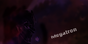
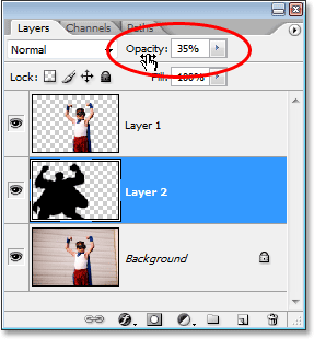
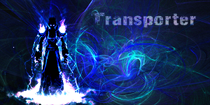
Your picture is a too dark. The background is obvs coloured but too dark. The object, which I'm guessing is Megatron?, is barely visible. I'm guessing you have him layered under a part of the background? You might want to pull it to the front behind the text to make it clearer. (If you want patterns etc over it, then you can just lower the opacity setting:
[spoil]
photoshop-opacity.gif
[/spoil]
Fiddle about with it til you find something you like.

Other than that, keep practicing! Watch youtube videos for basic know how!

Can't wait to see what else you come up with!
 

DeletedUser104020

Guest
Thanks 12azor.

Well in my eyes i think this one is better but still far from average signatures. Ill keep trying my best though.


Transporter.png
 

DeletedUser104020

Guest
Untitled-3.png
Another one i just had a go at. I gave smudging a go. tried working with a few other things too,
 

DeletedUser

Guest
It looks like the doctor is melting. Also there's a clear outline of where you pasted him in.
 

DeletedUser104020

Guest
Heres an all right one in my eyes, way better than the doctor who one :D.

Untitled-1.png
 

DeletedUser

Guest
Not too bad mate but you an see a black square around the clown, even though you tried to hide it. when looking for an image search for something like clown render. This will give you a clown that has no backgrounds attacked to it.
 

King Sean04

Guest
I know I might be a little late but I'll give my critique on these pieces. What software are you using?

Megatron.png
I Don't mind if you tell me whats wrong with this.

The piece feels really empty and could use some more effects. Also, I could barely see Megatron on my laptop. Be careful with your text, since now we have a dual focal where your text stands out more than the actual focal point. In this piece, your text should blend in with the piece. As 12azor pointed out, always think of the rule of thirds. It will help you figure out where to place your focal.

Thanks 12azor.

Well in my eyes i think this one is better but still far from average signatures. Ill keep trying my best though.


Transporter.png

Better than Megatron :D Your text is incorporated better and your focal is in an ideal location. The C4D's in the background could use blend modes/opacity but overall better than Megatron. Keep it up :)

Untitled-3.png
Another one i just had a go at. I gave smudging a go. tried working with a few other things too,

:| I think I'll leave this one alone... Learning experience.

Heres an all right one in my eyes, way better than the doctor who one :D.

Untitled-1.png

Better... The text is incorporated well but I can see the box around the clown head. Using the eraser tool you can erase the box.


All in all you've showed some flashes of promise and it seems you are learning steadily. Keep watching video tutorials or even the tutorials in the tutorial section of the forums. There are great ones there and they are labeled for difficulty. If you want to learn smudging Harbinger has a really good one in his graphics blog.
 
Top