Nightblade.greyswaandir's sig workshop

DeletedUser

Guest
he hey, that last one looks pretty damn good. Cant see anything wrong.
 

nightblade.greyswandir

Contributing Poster
Reaction score
24
walking400x180border.jpg
_____
GMsig400x200border.jpg

border on both
 

DeletedUser

Guest
try a border of 2-3px and on the right sig the blurring isnt complately blurred, you can make out what it is and it doesnt quite look right...
 

DeletedUser

Guest
I agree with green.cheese about the blurring part. But hey, Still looks sweet :)
 

DeletedUser

Guest
You lack teh flowz.

The bumblebee one...it's SO easy to add flow to that. Why didun j00? =*(
 

nightblade.greyswandir

Contributing Poster
Reaction score
24
AgainstTheWall

brodis123

har45

Faetzy

TAHLIAMARX

Dysinct

TheRiverStyx

Destruction Phoenix

dayjays

SirEwok

this are on my waiting list, if i forgot somebody please let me know.
 

nindel

Guest
Very nice signatures nightblade! :D

Shame the restrictions here mean the height is only 80pix, but you've made some great signtures ;D
 

DeletedUser66411

Guest
Hey Grey, thanks for the sig w40... Do you think you can make me one for W30 Account Razvantc tribe BD... Thanks
 

DeletedUser

Guest
Oh my, your pace of improvement start to scare me... :icon_eek:
Then again you can expect a steep learning curve from a person who is using programs immensely more advanced than PS on a daily basis.


Some lack a bit of flow (2nd really needs some along the arm, really subtle though and fitting the background). Also, the poking-out things in 1st, 2nd and 3rd (gun, hand, gun) could do a bit more blurring, as they are much closer to viewr than the rest. They seem to be blurred already, but at least the 1st should be blurred a bit more in my opinion.

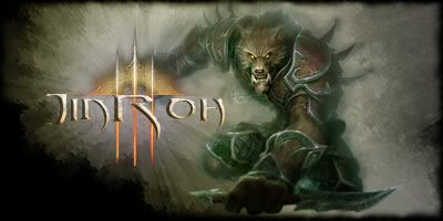
The way the text (main one, get rid of the smaller text) is interacting with the render in 2nd.

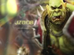
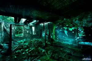
I like the background effects in 3rd, but the focal isn't standing out as well as it should. Try darkening the sides a bit to draw more attention to the guy.

4th is a win. Simple, but win. A simple win. Well, you get the idea. Didn't understand the idea of it, though, but anyway...

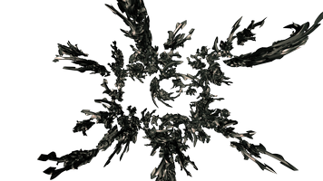
5th just looks amazing. Yet I first thought it is an abstract, since itš quite hard to tell what exactly is there.

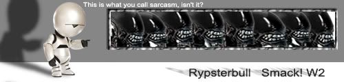
I just don't like 6th, too colorful to my liking. Text needs a bit more standing out colors. The placement and style is very good.

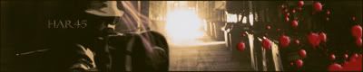
I don't know why I don't like 7th. It looks very good but I just don't feel it. It's a bit more boring than your other works. Nevertheless, it's very well and neatly done, nice colors, good flow, etc, except that the light source is a bit too bright and is creating a second focal.


Writing long text about other people's work is much more fun than making something myself.
 

nightblade.greyswandir

Contributing Poster
Reaction score
24
first thank You VERY MUCH! i like your constructive and concise style.
here are edited sigs

BH2424v2.jpg
<new | old>
BH2424.jpg


JinRoh2v3.jpg
<new | old>
JinRoh2.jpg


450x150v4.jpg
<new | old>
450x150v3.jpg


extremesports.jpg
<new | old>
extremesportsSOTWTW_UK.jpg


No7 is one c4d and one render, they blend with almost non of my actions, i just deleted overlapping parts. there is no spirit in it, and you felt it.

thank you again.
 
Last edited:

nightblade.greyswandir

Contributing Poster
Reaction score
24
boys and girls, i tomorrow i have to start new RL professional project, so i no more time for me too look over internet for renders, backgrounds, C4Ds, sorry. from now on you must do search and come to me with at least some details about your signature.

Please look for suitable pictures on
#1. Planet Renders
#2. Deviantart
#3. Stock.XCHNG

and please post here in next form:

main picture/focal/render: _____ (this is the main theme of your sig, like dragon, warrior or else...)
example:
YodaRender.png


background: _____ this is ... background
example:
War_by_alexiuss.jpg


details: _____ some detail, insignia, blazon...
example:
fc40420.jpg


C4D: _____ this is abstract pattern, which you can find on planet renders
example:
7copy.png
or
bluediamond.png


text: _____ min text, tribe, quotation... you want on your sig

size: _____ .net size is 80x700, and spoiler size is max 200x400

element/main color of signature: _____ fire/red, earth/dark, air/light colors, water/heavy colors... or colors combination you like


please fill this or i will not be able to fulfill your request!

main picture/focal/render:
background:
details:
C4D:
text:
size:
element/main color of signature:
 

DeletedUser

Guest
Me still wants to see some of you professional CAD designs. :icon_rolleyes:
If they are not classified, of course.
 
Top