DeletedUser122414
Guest
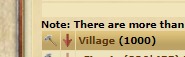
As you can see above the to two icons from the overview-->building table on the far left are small. The red down arrow to demolish buildings has an area on the tip that makes it easy to select however the hammer is a much smaller area and is very difficult to click even when you mouse over until you see the pop-up telling you the function and then click. If the area inside the square that allows you to activate this function could be enlarged so that it truly corresponds to the area where the pop-up is showing or switch it to a green up arrow the same size as the red one would eliminate much frustration in using this feature.
