DeletedUser
Guest
Unique Fatality vs Yurtles
Voting will close on Tuesday 7th June.
Theme was defaults
Rules:
• You have 3 days to make your signature. After that any tweaks you make cannot be changed;
• No pre-mades;
• Maximum size: 600x200 (for this round) (If you want to make a vertical signature then flip the limits);
• Entering your entry before the time limit of 3 days is up gives you no advantage to winning;
• The theme for your signature will be selected and you must abide by this theme;
• If you are competing then you are not allowed to vote;
The signatures:
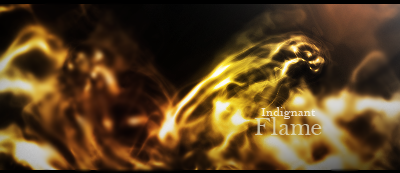
1)
2)

Good Luck to both of you
Voting will close on Tuesday 7th June.
Theme was defaults
Rules:
• You have 3 days to make your signature. After that any tweaks you make cannot be changed;
• No pre-mades;
• Maximum size: 600x200 (for this round) (If you want to make a vertical signature then flip the limits);
• Entering your entry before the time limit of 3 days is up gives you no advantage to winning;
• The theme for your signature will be selected and you must abide by this theme;
• If you are competing then you are not allowed to vote;
The signatures:
1)
2)
Good Luck to both of you
Last edited by a moderator:

