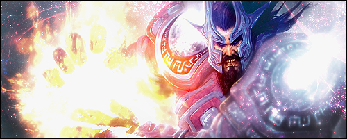
And if you want to know Why I think they're similar, all 3 are of a humanoid figure focused onto one side with their hand(s), in some way glowing, outstretched to the other side. 3 less so than 1 and 2, but still kind of similar.
Okay that point makes sense and I agree. Also consider though that when asked to do a "freestyle" most signature makers will resort to a humanoid figure 8/10 times, no ? I also feel like they all use colour completely differently, the first goes for a multiple colour bright piece, the second resorting to a darker colour scheme with the hints of colour and then 3 using an overall colour for the piece only straying from those colours to create light and dark spaces.
I actually didn't notice the whole thing of all of them seeming to hold a ball of energy so good point there.
#1 - Is good, perhaps a bit over the top with the bright lights though ?
#2 - Feel like it could be good but the colour scheme is just dull making me feel uninterested
#3 - I think this is the best put together signature overall, using colour/composition etc. feel like I know who made this, welcome back
#4 - It's different which is nice, it just doesn't feel amazing, maybe a better colour scheme ? Also if you can't do text, leave it out. It takes quite a while to get used to being able to add text and for now, it's probably best to leave it out. ( That's what I did for a long time )
#5 - Good layer effects
Effects don't make a signature, the effects in 1 and 3 are good but when some of the more major design principles are skipped over it leaves a disconjointed feeling.
I'd be interested to see what major design principles you feel were left out ? ( I didn't create any signature here so there's no agenda, I'm just curious )