DeletedUser
Guest
This is my first portfolio so... here goes nothing! Right now these are just my past sigs, avvys, and CoA that i made in Gimp
Work in progress
Shop
Avatars
[spoil]


 [/spoil]
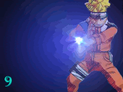
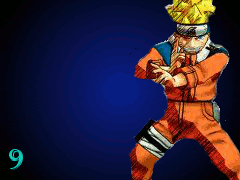
Signatures
They are in the order i made them so they get better the farther you go down
[spoil]

 [/spoil][spoil]


 [/spoil]
Animated CoA
[spoil]
 [/spoil]
CoA
[spoil]

 [/spoil][spoil]


 [/spoil]
Misc
[spoil]

 [/spoil]
Work in progress
Shop
Avatars
[spoil]
Signatures
They are in the order i made them so they get better the farther you go down
[spoil]
Animated CoA
[spoil]
CoA
[spoil]
Misc
[spoil]
Last edited by a moderator:
")
