Undead Billy Mays
Contributing Poster
- Reaction score
- 294
Hi Graphics Community
I want to take a little time and break down some design basics for those of you constructing signatures for fellow players. It has become an unappreciated art and we aim to remedy that :icon_cool:
I have the tribal wars community and other designers for helping me get interested in the field I work in today. I have always had an appreciation for art both physical and digital but Tribal Wars is where I really started to put that interest to work.
Creating a signature can be done in many programs. I started with a glorified MS paint program, moved to gimp and then on to Photoshop. As long as you understand the basics of design you can create a good signature without fancy tools and programs (but they do help)
I want to use this as a basic overview and I'll be adding to this thread as time goes on. Please feel free to ask questions, discuss methods, or even offer suggestions. I don't consider myself the most expert of experts but I do have some experience which I want to share.
3 is a designers number and it's a friend to anyone creating a signature. When I am doing a signature or just any piece of work really I try to remember this rule. It is taught to be more aesthetically pleasing to the senses. You do not need something interesting at every point but you do want points of interest on at least one of these marks. I chose to put the wording on the top right and have the head centered on the entire right line. This is not a rule you ALWAYS have to use but it will help to balance your compositions more often than not.
I'd love this thread to be as interactive as possible so feel free to post sigs you are working on that may need some help with this element of design. I want to start with the basics so if you are way past this feel free to contribute by helping newer designers with projects they may be struggling with.
Thanks for reading!
I want to take a little time and break down some design basics for those of you constructing signatures for fellow players. It has become an unappreciated art and we aim to remedy that :icon_cool:
I have the tribal wars community and other designers for helping me get interested in the field I work in today. I have always had an appreciation for art both physical and digital but Tribal Wars is where I really started to put that interest to work.
Creating a signature can be done in many programs. I started with a glorified MS paint program, moved to gimp and then on to Photoshop. As long as you understand the basics of design you can create a good signature without fancy tools and programs (but they do help)
I want to use this as a basic overview and I'll be adding to this thread as time goes on. Please feel free to ask questions, discuss methods, or even offer suggestions. I don't consider myself the most expert of experts but I do have some experience which I want to share.
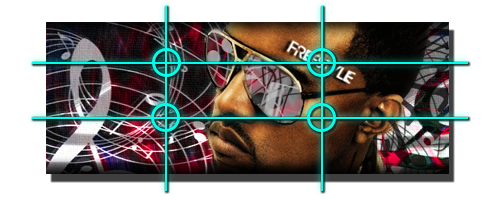
For this post I'll use this signature

Lesson 1: The rule of thirds (The golden ratio)
Lesson 1: The rule of thirds (The golden ratio)
3 is a designers number and it's a friend to anyone creating a signature. When I am doing a signature or just any piece of work really I try to remember this rule. It is taught to be more aesthetically pleasing to the senses. You do not need something interesting at every point but you do want points of interest on at least one of these marks. I chose to put the wording on the top right and have the head centered on the entire right line. This is not a rule you ALWAYS have to use but it will help to balance your compositions more often than not.
I'd love this thread to be as interactive as possible so feel free to post sigs you are working on that may need some help with this element of design. I want to start with the basics so if you are way past this feel free to contribute by helping newer designers with projects they may be struggling with.
Thanks for reading!


")
