DeletedUser
Guest
Hello, I've been bored for the past hour or so, so I have decided to start a new collection of Siggeh's, I will be online for hopefully the next three hours if you'd like a request but I'm not promising anything. Keep watching this space as I will hopefully be uploading more :icon_smile:
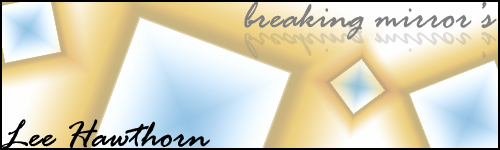
"Breaking mirrors" is from complete scratch, no found imagery, nothing used except for basic PS5 tools. I named it breaking mirrors due to the fact the images I created while playing around look like mirrors however the cross in-the-middle transforms it into a broken mirror.
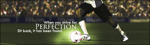
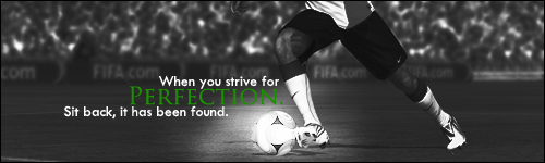
"Perfection" is a piece inspired by Hugo's current sig, and he can use this if he likes. It is of course an image I found from the internet however I have edited it, as you can see the overall image is darked whilst the area around the football is brightened, I particularly like the typography. Like I said, Hugo, this is for you, if you want it. Also added a B&W version.
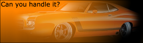
"Handle" is a piece that has been heavily edited however looks similar to the original image because the heavy editing is very blended in my opinion. I was originally inspired by the fact mustang16 has no sig, however upon trying with several mustang cars it became tiresome, however I came across this while searching for something else, I am not entirely sure what type of car it is. I think the typography could be improved however I think overall the sig is decent.
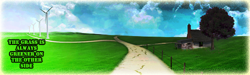
"Thegrassisalways" is an image I found on the internet that I think is amazing and I decided to play around with it. It looked very bright and springy which gave me the idea of "the grass is always greener on the other side" so I darkened one side, enlightened the other and wallah. The typography could be much better.
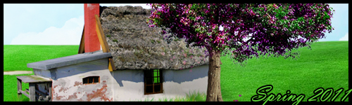
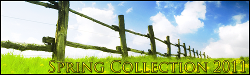
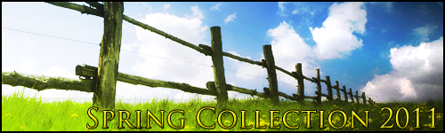
"Spring 2011" is a twist on "thegrassisalways" using the same image, in a different way. I zoomed in on the house and tree and brightened it to give it an "over exposed" look, gave it a big border and layered the text infront of the border, which gave a nice effect in my opinion.
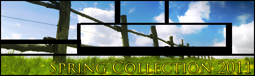
"Meadow" is a semi-collection of three of the same images, given different effects. The first one, was chopped into several parts and each part given a border, this was inspired by recent graphics course work I am doing. The second is the original image brightened. The last in the original image brightened however given a darkened patch in the corner to give an effect of "evil creeping in."
"Breaking mirrors" is from complete scratch, no found imagery, nothing used except for basic PS5 tools. I named it breaking mirrors due to the fact the images I created while playing around look like mirrors however the cross in-the-middle transforms it into a broken mirror.
"Perfection" is a piece inspired by Hugo's current sig, and he can use this if he likes. It is of course an image I found from the internet however I have edited it, as you can see the overall image is darked whilst the area around the football is brightened, I particularly like the typography. Like I said, Hugo, this is for you, if you want it. Also added a B&W version.
"Handle" is a piece that has been heavily edited however looks similar to the original image because the heavy editing is very blended in my opinion. I was originally inspired by the fact mustang16 has no sig, however upon trying with several mustang cars it became tiresome, however I came across this while searching for something else, I am not entirely sure what type of car it is. I think the typography could be improved however I think overall the sig is decent.
"Thegrassisalways" is an image I found on the internet that I think is amazing and I decided to play around with it. It looked very bright and springy which gave me the idea of "the grass is always greener on the other side" so I darkened one side, enlightened the other and wallah. The typography could be much better.
"Spring 2011" is a twist on "thegrassisalways" using the same image, in a different way. I zoomed in on the house and tree and brightened it to give it an "over exposed" look, gave it a big border and layered the text infront of the border, which gave a nice effect in my opinion.
"Meadow" is a semi-collection of three of the same images, given different effects. The first one, was chopped into several parts and each part given a border, this was inspired by recent graphics course work I am doing. The second is the original image brightened. The last in the original image brightened however given a darkened patch in the corner to give an effect of "evil creeping in."
Last edited by a moderator:
")
