Mojo, you are a complete idiot, and you must be blind. Most likely, isloman just got the picture, resized it - the easiest thing to do on photoshop, infact, the picture might have already been the right size - , stuck it on a canvas. Then went and put a thickj border around it and some text in a basic font. No special effects whatsoever, perhaps some lighting, but not skillful lighting, as I can't see much. Isloman, why don't you make a tutorial for your magnificent signature? I could do one, hang on:
1) Make a canvas sized: ##X##
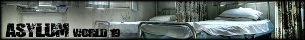
2) Stick this picture of a mental asylum on it.
3) Put a border on.
4) Wil a competition.
Mark's is better. has no special effects I can see, unless he made the smoke himself, which he may have.
Here is what I propose for next time, sig makers have to post what images they used in it, including renders, stocks and C4d's. This way we can see what they have done. Islo, I will take back everything I said, if you can show me that what you did WAS indeed skillful. Make a tut or give post your images.

")

