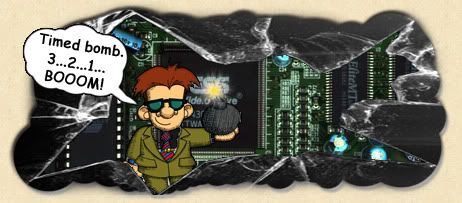
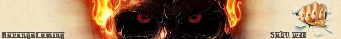
Timed bomb.
Guest
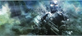
Thanks I <3 it

Thanks I <3 it
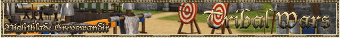

I think it would look cooler if instead of the Hq in the backround have the acadamy. (matchs the noble as well)COA
spoiler sig
.net sig and avatar

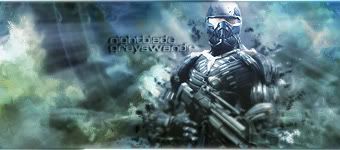
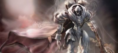
good one, it look like fire warrior is coming from some cave or volcano cave by crushing all on his way! great text placement and effects, good blending. i like it a lot! Thank You! i will be happy to make you one in return.
Could you return the favour maybe
nice works
you should incorporate into your sigs for more highlights that are partially a bit boring. some are a bit blurred at the edges of renders. and do not use too many effects. work more with sharpness and depth.
You want your renders to have some blurred edges, not the whole render has to be focal but possibly the face or a weapon the render is holding?
Do you have a tut for this one? I love the way it looks ._.
you think same as me, but i did it on some other sig making forum and there i got critics about not focusing on his face and taht weapon is too sharp...
here for example The weapon is blurred too much. does not fit. I would even take away entirely.