First Designs

  • Thread starter Jorge the Minion
  • Start date

DeletedUser

Guest
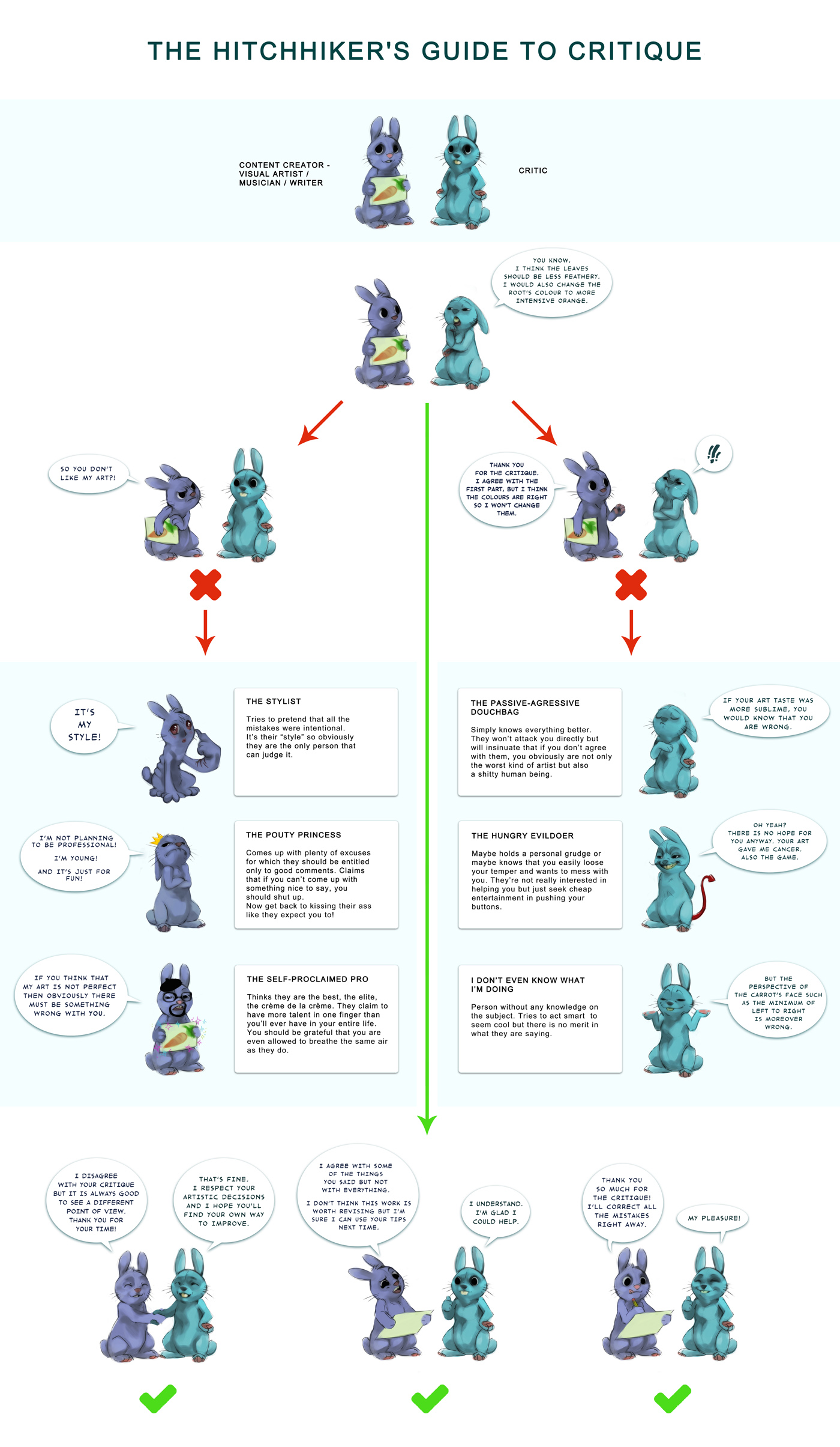
Well it's not very good, but it was only with photoshop elements, so there is not much available to do with it.

minionscopycopy.jpg
 

DeletedUser

Guest
It looks like all you did was write the text and do an unsatisfactory job of coloring in the sign?
 

DeletedUser

Guest
It actually consists of 6 layers XD. I am looking for tips mate, not criticism. I already understand it is bad work.
 

DeletedUser

Guest
Post what you started with, it'll make it easier to give tips.
 

DeletedUser

Guest
It actually consists of 6 layers XD. I am looking for tips mate, not criticism. I already understand it is bad work.

Alright I'll give you few tips.

Will start with the basic: Every single piece needs a border. I'm not aware of how much you can do with Photoshop Elements, but always have a black/while border. In tw forums, I think a simple black would be the best, white doesn't show much.
There are too many focals in it. You want the people to just stare at one focal; either it be a person or object. Everything beside it should be blurred or blacked out. Go through the tools there should be a brush to blur with.
Don't overuse the filters available. I don't know the name, but I clearly can understand what filter was used. Being honest, that COA looks very messy because of that filter. Most overused filter is the Sharpen filter. It definitely gives it some natural depth, and I would reccomend that you use that more often. Not the sharpening tool or the smart sharpen, just the filter effect.
Solid colours is something that will never be appreciated on something that has many details on it already. The text Jorge the minion, you typed it on a solid blue shape you created. It doesn't look nice, it doesn't match with the background nor the render To bring out your text, use a contrast colour, give it a shadow through layer properties.
Aware of the colour wheel? I'm sure you're not. You can make Tags with any colour, and they might seem nice, but there are ways to please the eyes more. With time you will get the hang out if, but for now work on the colours you get with the object,
I just noticed your sig, you distorted it. What does it mean? Well if you resize any picture without keeping its ratio's fixed, it will kill the details and make it look ugly. The picture you used, doesn't seem to fit the tw sig limits? Then this is why you learn photoshop. You learn to "Cut-Out" the picture the requester asks, and try to fit it in a new background, and making sure it looks decent.
There has to be a meaning, no not a picasso meaning, but has to have a sense to it. What I can see is, one little yellow man shooting laser from it's eyes but wayyyy at the back there is fire, whilst the whole garden being green.

Don't get intimidated by the mini wall of text, it's better reading through tutorials that only teach you a basic skill with no relation on how you can use it elsewhere.

Give me a printscreen shot of what this Photoshop Elements looks like // to lazy to google, lol.

------------


Alright an example. What I understood from the COA was, you wanted to show this Jorge who's a minion, kind of in a confused state (the one at the way back). So I took that and I hope you could follow with how I progressed through the COA.

coagtm.gif
---->
14tc2nd.png


Sure it doesn't look so real and probably lighting needs some work on. I didn't even try to make it look fancy, just a cut paste job. But trying to make the elements fit in something important. If I used some haunted house as the BG, I don't think it would suit the yellow creature well. + The crop needs work on, but I hope you get my point. Execution is the most important thing to me, even concept, colour tone or even depth. Make it look pleasing.
 
Last edited by a moderator:

Undead Billy Mays

Contributing Poster
Reaction score
294
Alright I'll give you few tips.

Every single piece needs a border. I think a simple black would be the best, white doesn't show much.
Most overused filter is the Sharpen filter. It definitely gives it some natural depth, and I would reccomend that you use that more often.
Solid colours is something that will never be appreciated on something that has many details on it already.
Aware of the colour wheel? I'm sure you're not. You can make Tags with any colour, and they might seem nice, but there are ways to please the eyes more.
Don't get intimidated by the mini wall of text, it's better reading through tutorials that only teach you a basic skill with no relation on how you can use it elsewhere.
Execution is the most important thing to me, even concept, colour tone or even depth.

Not all pieces need borders. You can create effective signatures without geometric solid borders. They don't even have to be constrained in a rectangle. I would say not to use the Sharpen filter too often, i actually prefer the sharpen tool to the filter.

Not sure what the color wheel comment was about - whats important about the color wheel is determining your color scheme - Using complimentary colors with your signatures if you choose, you also have different options with analogous color schemes etc etc.

Tutorials are wonderful - Use them often
Concept is Key - execution is important. They go hand in hand though - Amazing Execution on a crap concept isn't as impressive as Okay execution on an amazing concept. Conceptualization is hard to teach where as execution can constantly be improved.

No offense to aqueel here but I just happened to disagree with quite a bit of what you said. Each designer has their own opinons of course
 

DeletedUser

Guest
Not all pieces need borders. You can create effective signatures without geometric solid borders. They don't even have to be constrained in a rectangle. I would say not to use the Sharpen filter too often, i actually prefer the sharpen tool to the filter.


Not sure what the color wheel comment was about - whats important about the color wheel is determining your color scheme - Using complimentary colors with your signatures if you choose, you also have different options with analogous color schemes etc etc.

Tutorials are wonderful - Use them often
Concept is Key - execution is important. They go hand in hand though - Amazing Execution on a crap concept isn't as impressive as Okay execution on an amazing concept. Conceptualization is hard to teach where as execution can constantly be improved.

No offense to aqueel here but I just happened to disagree with quite a bit of what you said. Each designer has their own opinons of course

Trust me I have no intention of being a nice guy, but I "HATE" people like you the most. :icon_rolleyes:
Never step forward to give a CnC, when was your last post in the GFX section hmm? Yeah the sigs you did in the past are outstanding, but please if you want to help a new guy go ahead, don't pin point my suggestions. I'm not here to write up a book.
Please keep your opinions to yourself and don't aim it toward me, kthnxbai.
 

DeletedUser

Guest
What? All he did was state his opinions, just like you... He even clarified that he meant no harm...
 

DeletedUser

Guest
Thanks for the help aqueel. I trust you and have seen your work. Your work is unique and I like it. So I am choosing to follow your suggestions. I will post a screenshot later today.
 

DeletedUser

Guest
Screenshot_1.jpg


Here is a screenshot. My school has photoshop elements 6. So that is what I use and what the screenshot is of. Photoshop elements 11 is out and if I can do enough stuff with it i'll probably get that since its only 80 dollars, but I'd rather scavenge for a cheap cs3 if it can't manage good work like you do.
 

DeletedUser

Guest
\
What? All he did was state his opinions, just like you... He even clarified that he meant no harm...

Oh please don't mind me. I'm just the Passive-Agressive Douchebag rabbit from here:

[Spoil]

CLICK THE PIC.

[/Spoil]

Lol, but seriously, you know what ticked me off? Is that many like this guys like jorge want to learn stuff, no one comes forward. And I knew, if I did, some over talented guy would show up and say, naah don't listen to aqUeel, he's right at some areas, but I completely find his other points bullshit. --'

Anyways, Jorge skype me at hertz.17 Will talk about your photoshop thing over there, sorry to spoil this thread, but Hopefully you can create a better one and run it at TwForums cause sooner or later I'm quiting lol.
 
Top