DeletedUser
Guest
I'm not blind... lol xD
"You just do not know", from the Translator.
Come to the german Graphics "Bereich?" and look.
"You just do not know", from the Translator.
Come to the german Graphics "Bereich?" and look.
Thanks for the feed back guys
You think using well punctuated constructions and slightly more complex syntax makes you superior? No. You're wrong. So just sit there in your wrongness and be wrong.
And no it doesn't. If you seem so certain, why not make one yourself and show us what you're talking about?
This is an assumption based on what? If I was doing what you are suggesting I would be picking away at the grammatical and punctual errors in your post - I am not.
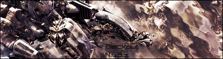
It's just basic's to see. The effect completely ruins the flow and depth of that signature.
No, you wouldn't be. You'd be trying to do so, but failing because there are very few.
It does ruin the depth and flow slightly. But not completely, and is better than some bad brushing and no blending which typically comes from the average user. Furthermore, how would it be changed without having to remake the sig from the first layer? You've got to build your comments around the person's skill level.
Yet I'm not which makes your original point useless.
Considering it's nearly 3/4 of the signature it does completely (some variation allowed) and it looks as if just one layer with an effect and the blending layers are seperate although I could be wrong.

I came to a shock when i done this
I made MYSELF a siggy :O
whoa
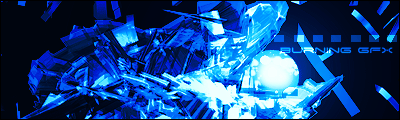
This is me experimenting CnC is loved as always
