You are using an out of date browser. It may not display this or other websites correctly.
You should upgrade or use an alternative browser.
You should upgrade or use an alternative browser.
Feedback New Quest System
- Thread starter JawJaw
- Start date
Skill Issue
Skilled Soldier 2020
- Reaction score
- 1,907
Announce 120 so I can test it sir, ty
HelloHeidy
Well-Known Member
- Reaction score
- 117
Is this saying you get a privilege for building wh2 farm 2?
wildwang
Non-stop Poster
- Reaction score
- 606
Going to re-iterate on a few feedback points and add my own. Not sure why I can't add my own images, but w/e.
Non-Intuitive UX:
1. Rewards tab ends up being under inventory screen in mobile screen is extremely unintuitive especially if users first use quest system on desktop.
2. Having the item in the top right suggests that the item will be a reward for completing the specific quest, but it ends up being the reward for the questline. A better way to have done this, is to show the actual questline with your progress, leading to the actual reward. Linked mock-up shows how showing progression can lead to better player clarity. Interface should also show if any of these quests give additional rewards (like a WH level, spears, swords, etc.): Mock-Up
3. Point 3 regards the quests on the left side: Current Interface. I understand the need for categories but does it really make sense to have the images so large? In addition, by default all links under a category should be default showing rather then current behavior where they are default closed. Seems like you added additional clicks due to the pop-up real estate, but this could easily be solved by making the 'categories' smaller.
Qualms I Personally Have:
1. Complete a quest,? You have to close the quest page and reload. This just seems like either the feature was hastily developed and released, or due to lazy programming. I don't have much insight into the TW code, but tracking how questlines intersect and progress should really not be that difficult unless you have spaghetti code to deal with
2. Quests just randomly appear after certain buildings are created. As a user I would like to know how I can unlock future quests and the rewards they give to know how to progress my start-up. Obviously this point won't be as relevant since future worlds will have w120 as a baseline on questlines, but it would be better to give info to the player instead of making them have to consult external sources (forum, discord, etc.)
Honestly there are a few quick wins that can be done to drastically reduce the number of clicks (point 3 comes to mind). The interface is decent, but there's still some work that needs done (feels more like a beta version than an actual production release). But overall, the interface seems to be coming along well and is a definite improvement over the previous one (change is always good).
Note I'm not a designer, but you get the general gist of my mock-ups, showing progression is key as I have no clue how far along I am in the questline (previous quest system also suffered from the same problem).
PS: Can you make the quest window ~80 pixels higher so we can see all the rewards without having to scroll
Mintyfresh
Skilled Soldier 18 & Master Commander 21 & 22
- Reaction score
- 4,382
Ragestyles
Still Going Strong
- Reaction score
- 514
they always have been inventory items, if you played beta server for it
Sir Romit
New Member
- Reaction score
- 2
I don't mind it, but I would prefer a separate icon for each quest.
Where can we find all the questline trees?
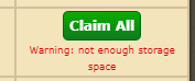
If I claim all the level rewards from a building using the Claim All feature, will it warn me if I'll exceed my warehouse capacity like the old system does?
A pop-up showing how many resources you'll receive would be nice.
"For every building level achieved, receive a percentage of the resources spent on the construction."
Is the percentage the same for all building levels and type of buildings?
"Resources are given only once per construction and are given for building levels achieved through nobling."
Say I noble a village with a level 30 farm. Do I receive all the resource rewards from level 1 to level 30, or just for level 30?
Where can we find all the questline trees?
If I claim all the level rewards from a building using the Claim All feature, will it warn me if I'll exceed my warehouse capacity like the old system does?
A pop-up showing how many resources you'll receive would be nice.
"For every building level achieved, receive a percentage of the resources spent on the construction."
Is the percentage the same for all building levels and type of buildings?
"Resources are given only once per construction and are given for building levels achieved through nobling."
Say I noble a village with a level 30 farm. Do I receive all the resource rewards from level 1 to level 30, or just for level 30?
Eakshow McGee
Still Going Strong
- Reaction score
- 973
I don't mind it, but I would prefer a separate icon for each quest.
Where can we find all the questline trees?
If I claim all the level rewards from a building using the Claim All feature, will it warn me if I'll exceed my warehouse capacity like the old system does?
A pop-up showing how many resources you'll receive would be nice.
"For every building level achieved, receive a percentage of the resources spent on the construction."
Is the percentage the same for all building levels and type of buildings?
"Resources are given only once per construction and are given for building levels achieved through nobling."
Say I noble a village with a level 30 farm. Do I receive all the resource rewards from level 1 to level 30, or just for level 30?
Quest Tree's isnt published far as i know, i have asked but no response yet...
For claim all, you get a warning...
For % its 10% of buildcost, but minimum is 150 150 100 and maximum is 2000 2000 2000
And for last thing, it should give you rewards for x-30 (x being the lvl of farm you have already built earlier)...
Sir Romit
New Member
- Reaction score
- 2
Thanks, I can plan a bit better now.Quest Tree's isnt published far as i know, i have asked but no response yet...
For claim all, you get a warning...
For % its 10% of buildcost, but minimum is 150 150 100 and maximum is 2000 2000 2000
And for last thing, it should give you rewards for x-30 (x being the lvl of farm you have already built earlier)...
Share:
