DeletedUser
Guest

This will be my showroom for all future logos and typography that I will be creating. My creation of signatures
is probably done as I am very much enjoying my time creating logos. Typography will be heavily included
within my college course so that will be where the bulk of that comes from for this.
All pieces are time ordered with newest first :

Simple GPS logo

A bit of typography I did, can't be bothered to write a proper description ... so this will do.
Version 2 :


Basically my college is split into departments for the different subject.
I am in Humanities which was re-named The Winter Knights. So I decided to make a logo.
[ LARGE SPACE OF WORK MISSED WHEN I WAS "AWAY" CANT BE BOTHERED UPDATE ALL WORKS ]

Most of you saw this one unfold, but still need to add it to my portfolio.
This was a logo design for a new youtube channel primarily focusing on xbox 360 gaming. With it being
regarding gaming I wanted it to look very modern. After my inital stage one of the shaping in black and
white, I was given the colours black and yellow to work with. So here is every step that I went through
to get to my final design. If you would like to see each step of the design in one place, just visit my blog
(link is in my signature)


For this brief I tried two different designs. One more of a modern geometry based design, along with
the second more traditional pen tooling design. The client wanted the idea of a mountain incorporated
into their logo. That’s why first went with the triangles overlapping, but to increase my chances of my
logo being liked, I wanted to include a traditional one as well.

Made for a company that sells car parts. They obviously wanted a very stylish design,
so I went for this metal looking logo. I also discovered that illustrator has glows and shadows
etc. while doing this, so expect some more of that in my future logos.

Made this for somebody on these forums who is launching I believe a youtube
gaming channel. They didn't give me much of a project brief, just the text and that
it needed to look good, so I came up with this.

I also found a project brief that pretty much perfectly matched my lightbulb logo I made
a few days/weeks ago. So I just switched the name on it, made it a bit more compact
and added the black/white version at the bottom.


I didn't really understand what this company does, but I gathered it had something to do with textbooks,
they asked for green colours, but were also welcoming other colours that designers thought went well. Which
is why I have done a green and red design.
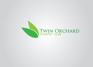
They didn't really give much in their briefing, they didn't know what colours they wanted or anything
so with it being twin orchard I thought it needed a double of something, which I decided two simplistic
leaves would do the job perfectly. Being slightly toned and one cutting out of the other really finishes
off the design, I feel.
Just another design style that if requested I can change into different colours for them.

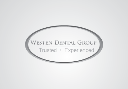
Following a project brief from a dental company, I created this logo. They didn't want much imagery, specifically
saying to steer clear of teeth images and general icons associated with dental practices. They requested earthy
tones and a modern-ish looking logo. This is what I came up with.
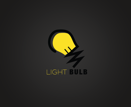
With this I was trying to create a very simple design which consisted of only 2 separate colours,
the obvious colours are yellow and black so I used them. The light bulb was created in illustrator
then background and text added in photoshop. Also a bit of subtle text en-corporation, I decided
to do "light" in a much thinner font than the word bulb, which in itself sounds bold.
I quite enjoyed making this simple design,
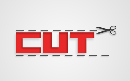
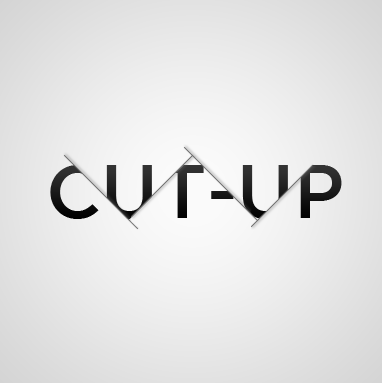
Can't remember where the idea for this came from but it just kind of advanced from me wanting to use
the little dotted cut lines as used on models etc.
Just a basic form of something I hope to advance onto on a later date. It is a bit big, sorry about that
I created it while being zoomed out and not realizing ... and I can't be bothered to re-size it now

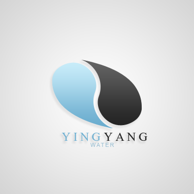
I was trying to do something with a water drop shape, when I rotated them into such a shape that it looked like
the yin and yang symbol. So I decided to incorporated that idea into the logo.
Last edited by a moderator:

