[POLL] SOTW 22 - Freestyle

  • Thread starter Genetic Engineer
  • Start date

Pick your favourite :


  • Total voters
    44
  • Poll closed .

DeletedUser

Guest
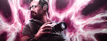
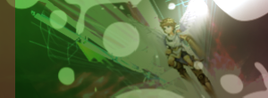
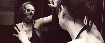
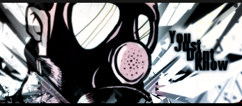
Welcome to the 22nd SOTW

The theme this week was Freestyle

Normal rules apply,

- Still no breaking of anonymity
- No voting for yourself

Voting will end on

Thursday 11th August 20:00 (gmt+0)

Have fun and vote for your favorite

1.
poweroftu.png


2.
twfreestyle.png


3.
camera_man_by_genetic_engineer-d45hm4v.png


4.
sotw22.png


5.
Fractiolo.png


6.
freestylepit.png


7.
frozen_visage_by_zenron-d45jfb5.png


8.
unled1nh.png


9.
radisotw.png


10.
youjustdontknow.png


Good Luck to all !​
 
Last edited by a moderator:

DeletedUser95815

Guest
4 gmv, but lighting is a bit to intense. :)
All of them are amazing though.
 

DeletedUser

Guest
*cough*anonymous is pointless *cough*
7gmv, best concept, execution and compo. 4 was nice to. 3 was my thirds fave, but the smudging lacks details and render is over sharpened D: gj though, gj to everyone :)
 

DeletedUser

Guest
Yeah, we worked out 8 of them in the skype chat reem :lol:
 

DeletedUser93879

Guest
no.8 for me. its just a really nice sig imo. and with no specific theme this week to compare them all to i went with the one that i would want underneath my posts on the forums.
7 is really nice though. and 9 has a nice fresh feel. really good job to everyone though *thumbs up*
 

DeletedUser81336

Guest
I'm going to post some half-assed CnC on these pieces.

#1: A decent piece, good lighting. I'm not a fan of the 'action' you have going on to the left of the render, kind of distracting from the focal.
#2: (Would have gotten my vote if I was voting). I'm a big fan of all of this artist's works too. :3 I like the flow of the piece, plus every sig needs sexy ladies. :)
#3: I like the smudging done here, idk why but for some reason the flow doesn't seem right to me. Not sure why though. :icon_confused: Render's a little over-sharpened.
#4: Not a fan of this piece. the text is done well and the render seems to fit into the background alright. I don't like the solid 1 C4D background though. The colors don't flow well though.
#5: Ummm.... I don't really like it, the lighting is well done but it doesn't seem to have any pizzaz to it. :eek: Pizzaz is a cool word.
#6: It seems to be very low quality, save it as a better quality file (.png is good I think). The render seems kind of dull as well as the background, kind of a boring sig in general. :icon_neutral:
#7: I like this artist's works as well. A good looking piece but it doesn't seem like it would be hard to make. I still like it though. :)
#8: A decent piece, the C4D in the render's hand could use re-coloring as I think that's kind of messing with the color flow. The cards look kind of forced into the sig though and don't really flow with the piece.
#9: Woopwoop sexy ladies. :eek: I like this piece, especially the text. :)
#10: I like it but the text doesn't seem to go well with the piece (can't really offer a suggestion or say what's wrong with it as I'm garbage with text as well). I don't like the grey top borderline though. :|
 

DeletedUser

Guest
I think I know who did 7 but it's a sweet piece. Love it.
 

DeletedUser92094

Guest
i think mine is quite obvious..
having trouble voting!?! :C
 

nindel

Guest
Mmmmm, quite a few pieces are nice but some seem to be overdone somehow; they have alot of potential but either the colour-scheme, effects or adjustment-what'sits just got a bit carried away:

Ie.

Numbers 1 and 5 have Massive light sources which tbh are way too large, and Number 2's gradient-map (I suppose? D: ) was too overdone with the render's lips turning a strange golden-yellow (unless that was intended, but don't quite like yellow lips on her D; )
Number 4's Dead Space render with Issac's dirty brown and blue lit visors didn't quite fit with the green overgrowth which surrounded him for me; it's a great idea and kudos to the person who came up with it because it was well executed, but tbh I didn't personally fancy it too much >_< (Well I'm just one vote so... P: )
Number 6 was just too dark D;


There are a few ones which were done okay/pretty well+ though :3


Number 8 looks almost fantastic, although some effects and colours seem a bit off it verges on being a great piece :3
Number 7 scared the crap out of me |: (And it's pretty awesome x3 But scarey T_T )
Number 3; Mmmmm, it's good and I see what was trying to be done their but doesn't seem like there's much focus directly on the focal with all the light-sources staying at the same brightness/intensity throughout the signature.


But in the end, Number 7 got me vote because brilliant concept, got a reaction out of me, and it's damn classy. (Mmmm, small text... mmmm :3)
 

DeletedUser

Guest
I really didn't like the colour tone of 7, good piece but the colour to me is really off. It's not black and white it seems like... Some kind of... grey/brown shade which is disappointing to me, because it's a good piece but that colour... :S
 

DeletedUser92094

Guest
2, 5, 9.
are easily the best in my opinion.
7 is nice, but freaks me out too much for me to like.
it just hits my soul, well more like touched gently like a paedophile but you kow what i mean. O_____o

Mine looks absolute poo to everyone elses. :(
 

DeletedUser

Guest
I have to pull out, I cheated :(

My girlfriend voted for mine, I didn't tell her which one was mine (she wanted to vote for fun) but she guessed which one was mine and voted for it.

She says she voted for mine because she thought it was the best but I don't believe her :p so I'm pulling out because I feel bad about cheating (I can't stand cheating in things like this). Mine was number 1.
 
Top