Gallery of A Creative Adventurer

DeletedUser

Guest
My sig for Sotw 3 awhile ago:
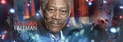
morgan_freeman_by_zenron-d39qedn.png


The sig I was going to enter for SOTW 5 but didn't feel like entering:
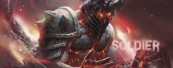
soldier_of_the_dammed_by_zenron-d3a1y3p.png


Cnc please? :)
 

DeletedUser

Guest
Soldier one is very nice. Great work, nice usage of colours, depth and the text in both pieces is perfect. Great work, kiu.
 

DeletedUser

Guest
It's called "Hiragino Kaku Gothic Std". It came as default with my mac but I'm not sure if windows has it.
 

DeletedUser

Guest
The first one is a strange one for me, I feel like the background ( freeman ) and the foreground really dont work together. They seem like 2 seperate things to me, both good on their own, but now together. If you used a gaming render for example with that foreground and those effects it would look great, it just doesnt work with the freeman stock :/

I might try changing the stock around, see what it looks like.
 

DeletedUser

Guest
Just deviantart. I downloaded a load of C4D packs from there awhile ago.
 

DeletedUser

Guest
Ok cheers very much :)
I think I have a couple of his packs actually :p
 

DeletedUser

Guest
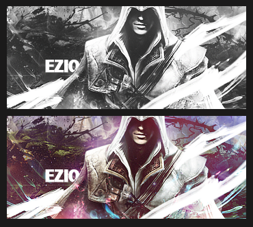
ezio_auditore_da_firenze_by_zenron-d3a9z61.png


Another one. The black and white version is the one I originally intended to create, but I felt like showing the colour version as well.
 

mattoematt

Guest
ezio_auditore_da_firenze_by_zenron-d3a9z61.png


Another one. The black and white version is the one I originally intended to create, but I felt like showing the colour version as well.

Try setting it more monotone the second one but still keep the colour. That colour on his left soldier would be a good one :icon_razz:
 

DeletedUser

Guest
newer version. It isn't really different but it's sharper now:

eziosing.png


Matt - I don't think it needs to be anymore monotone. The current scheme I went for is blue, purple and green with the purple being most prominent. I wouldn't want to make the purple any more prominent as you suggested, and it's good a perfectly fine analogous colour scheme at the moment anyway.
 
Top