Rate The Desktop Above You

  • Thread starter Sir Josh The Lagstah
  • Start date

DeletedUser

Guest
I shall use this occasion to comment on your sig. :3

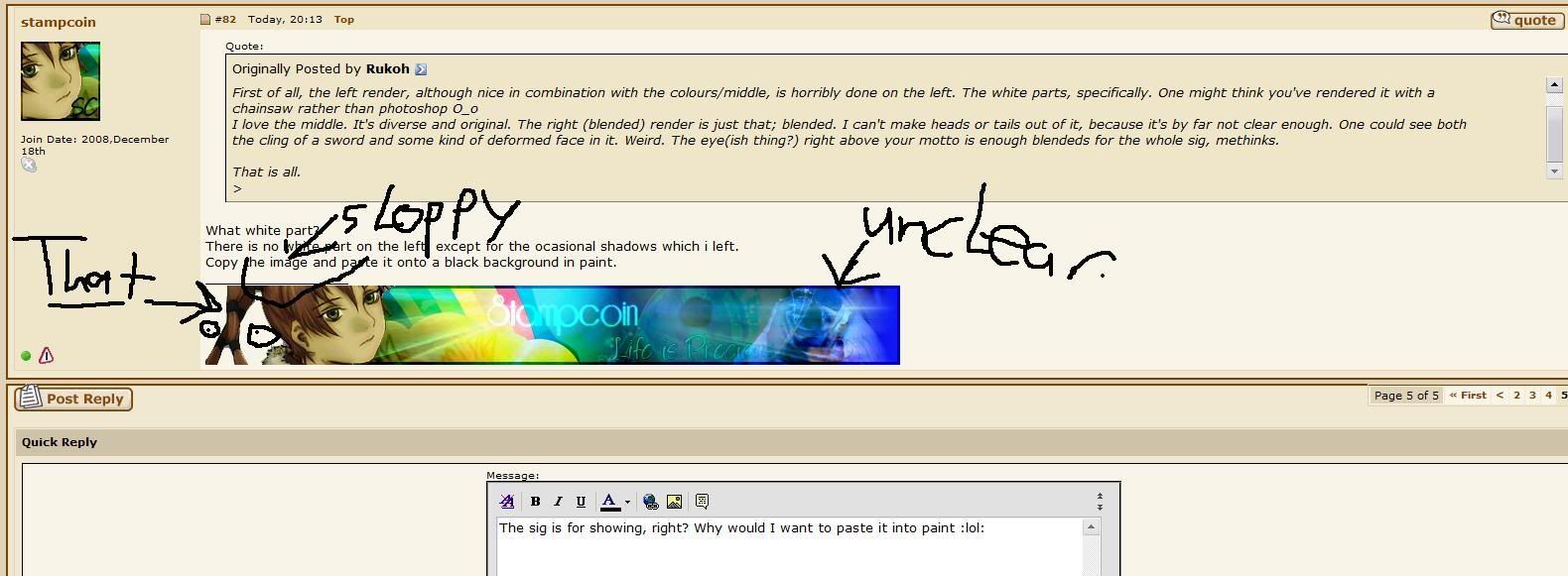
First of all, the left render, although nice in combination with the colours/middle, is horribly done on the left. The white parts, specifically. One might think you've rendered it with a chainsaw rather than photoshop o_O
I love the middle. It's diverse and original. The right (blended) render is just that; blended. I can't make heads or tails out of it, because it's by far not clear enough. One could see both the cling of a sword and some kind of deformed face in it. Weird. The eye(ish thing?) right above your motto is enough blendeds for the whole sig, methinks.

That is all.

What white part?
There is no white part on the left, except for the ocasional shadows which i left.
Copy the image and paste it onto a black background in paint.
 

DeletedUser

Guest
The sig is for showing, right? Why would I want to paste it into paint :lol:

stampcoin.jpg
 

DeletedUser

Guest
If you paste it onto a black background in paint, you will see it is transparent.

Not sure what those two circles within cirles are.

The That Sloppy is meant like that as it is a shadow.

As for the unclear part. Yes that it is, i started making something else and then switched half way through
 

DeletedUser

Guest
You lack attention span!

I -know- it is transparant, silly goose. What I was commenting on, was that it was sloppily rendered. Whether I call it white or 'very-very-light-colour-that-is-forums' is hardly relevant in this case. Fact is that the chick's hair is horribly rendered. Choppy.

How is it horribly rendered?
 

DeletedUser

Guest
It is choppily done. Pixellated. Non-smooth.

Particularly; the parts right on top, the part on the back of her head (or does she have a tumor?), the little part in her neck (grey?), and the verymost edge. I would sincerely advise you to -zoom in- more when rendering, because that enables you to make more 'points' per amount of pixels, giving a smoother render. Also, you're aware of the 'curves' you can make while rendering, etc?

I am aware that i can do that i just chose not to.

Now lets see you make a sig from her.
 

DeletedUser

Guest
I am aware that i can do that i just chose not to.

Now lets see you make a sig from her.

Why would I? For that matter; why would I have anything to prove to you? I gave you suggestions on how to fix that sig of yours, this almost makes it seem like you're throwing them back in my face. My, how rude. And here I thought you were the higher ground, being 'free' sigs 'n all, as well as an old player :icon_wink:


But, if you're asking; Yes, I can render better than you did. I don't see how that is relevant, though.
 

DeletedUser

Guest
Shuddup? He was giving you advice on how to improve your sig. Thanks was all that was needed :)

I already knew how i wanted this sig and what he was suggesting was not something that would have improved it in my opinion
 

DeletedUser

Guest
I already knew how i wanted this sig and what he was suggesting was not something that would have improved it in my opinion

But he didn't know you was happy with it. He tried to help. Please tell me you aren't a consequentialist?
 

DeletedUser

Guest
But he didn't know you was happy with it. He tried to help. Please tell me you aren't a consequentialist?

I don't think he was trying to help, he was more trying to point out as many things wrong with it in his opinion as he could because mine are still better than Rob's and mine are free Rob's are not
 

Caleb1996

Guest
i dont personally like your sig but i think you did it very good
 

DeletedUser

Guest
I don't think he was trying to help, he was more trying to point out as many things wrong with it in his opinion as he could because mine are still better than Rob's and mine are free Rob's are not

I was commenting on yours, not Robs. Furthermore, I also commented on the parts that were good. Stop being a prissy bitch, if you don't want people to critique on your sigs, you should get the hell out of the thousand 'I make sigs' topics :icon_neutral:
And grow a thicker skin, at that.

I already knew how i wanted this sig and what he was suggesting was not something that would have improved it in my opinion
How can smoother rendering not improve a sig? That's like saying a pixellated .gif is better than a HQ one. :icon_neutral:
 
Top