Critique Thread

DeletedUser100345

Guest
musicb1b829e2png.png


what do you think? ;-)
 

DeletedUser

Guest
Trying some new styles etc. I'll be releasing the PSD for the first one soon as
I am quite proud of it and it could help others as it has a lot of different techniques in it.
The second one was merely trying a completely new style that I have never tried before.
I know it's a bit bright, but I really couldnt be bothered to edit it once I got to that stage
so just finished it there.

halo.png


experiment.png
 

DeletedUser95815

Guest
1st one, maybe add a bit more flow to the render but apart from that good.
2nd one, a bit bright (joke) Border is way to big imo. The signature defiantly needs something else though but not sure what.
Like these new styles though. You should make some more of you simple tags (not simple to make but you get the point). kiu man. :)
 

DeletedUser

Guest

Shak, another awesome one. i really like this new style, great effects, but next time try and avoiding the bubbles as it can get repetitive, try some different C4D's but with smuding and filters. Although again awesome new style and tag.
 

nindel

Guest

Very pretty effects and it looks good :3

A bit over contrasted+saturated though, mostly to the right of the signature. Also, I'm being forced to look at too many focals in the signature; the person's face, the brush, the swirly C4Desque object to the left, the text and the person's hand mainly. The signature looks very full of effects tbh ;O

Overall though, there's definitely been some work done in it which I can appreciate, and it looks nice which is what counts :3
 

Burning GFX

Guest
fantasyb.png

follwed a tut by alex donkers

I like it abit hmm empty in the background though some C4D would compliment that nicely or ruin the sort of sig it is tbh lol. i Like it :)

DeepSpace.png


CnC pwease :)

Half followed a tut then got sidetracked by my own ideas :D
 

DeletedUser

Guest
Dang everyones gotten so good while I was gone :O Seriously the gfx forum has become like voodoofx, I'm loving it :D I guess I should cnc while I'm here..
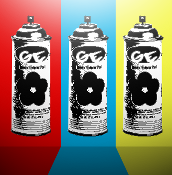
GE, your pieces get more professional each signature. Those pieces look like someone professional made them :)

shak, I'm glad to see you've gotten over that one state you've been in recently and have moved onto new styles, the two pieces you have made look great.

yurtles, your new tag is a good step up from your recent ones that i have seen, kiu.

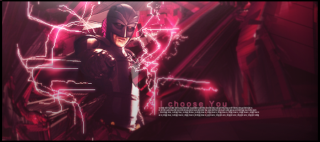
Lucario, you've improved quite a bit, I see your still trying to find the best style that fits you the most though. Try to add little things in that make the signature pop.

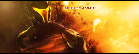
Burning GFX, I like your previous signature a lot, it just has a nice look to it. I like your dead space signature but the right side looks a little empty. I'd maybe shrink the signature size.

I think it's finally time for me to get on PS again and start making something :p
 

DeletedUser95815

Guest
@Hardcore - Nice tag. Colors don't fit imo and the C4D that comes down through the eagles wing should be smudged or have other C4D's with it.
 
Top