DeletedUser
Guest
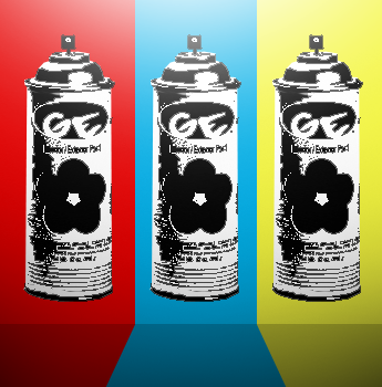
I know its not what we are used to but ... what do you think of this:
What's it for?
I know its not what we are used to but ... what do you think of this
Nothing, just general art
Nothing, just general art
The elephant is quite obviously photoshopped in there.


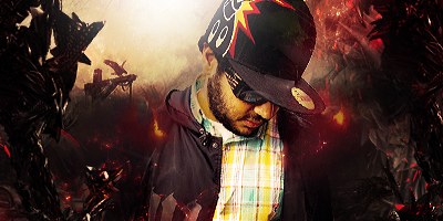
inspired by spann :icon_razz: (WIP)
(WIP)
D xD
The splashes in the background blend into the shirt slightly. Colors on the text is similar to the entire signature, why have such small text?inspired by spann :icon_razz: (WIP)
:icon_redface:
k thxgrad mapping is too obvious, colours should of been controlled a bit more.
a wizard id it :icon_eek:why is your render centred :S