Soberknight
Guest
Lol, why'd you exclude 1984?
??? The red thingy, right side of the map?
Lol, why'd you exclude 1984?
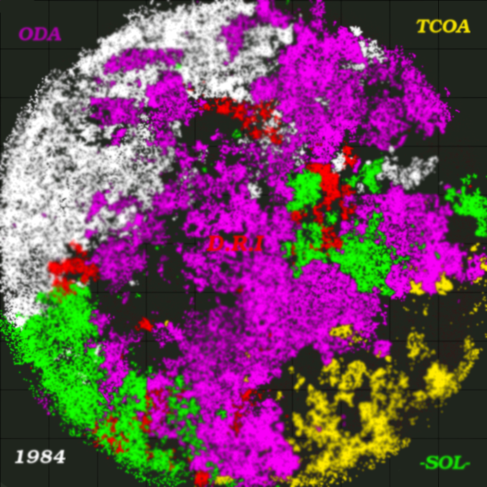

Okay, i made another one, and i took both silvas and "the jacal"'s words into account, as well as making some other improvements, and i must say, i think this one came out much better than the last one.
[spoil][/spoil]
If anyone has any suggestions for my next one, please let me know
Full list of improvements:
Brighter background color
Placed the labels in the general locations of the tribes on the map
Used less blur, and burned only the markers
Used only markers
~Michael
it hurts my eyes
Other than that, nice 
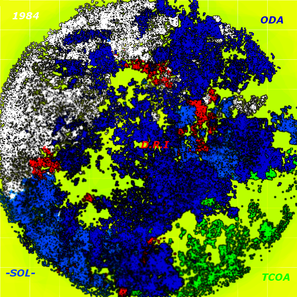
Okay guys, here's my latest map, and i think it's my most successful one so far. Please feel free to tell me if you think otherwise.
[spoil][/spoil]
~Michael
will post the result later.

