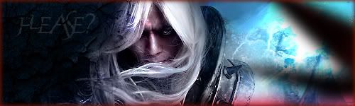
Personally I think the lightning stand out just a tad bit too much and I would like to see a bit more of the wolf in the upper right side but all in all I like it.
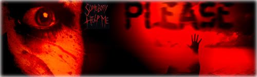
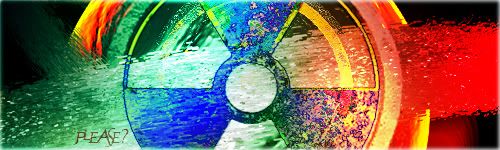
21 I really like how you put the PLEASE text in, there is no 1 main focal, and I think it's too red.
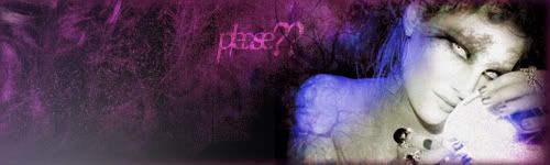
22 I like.
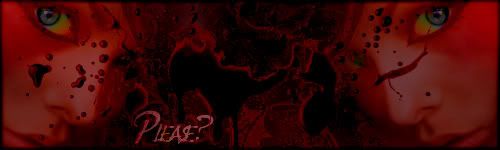
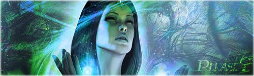
23 1 face would look really nice instead of 2,, I think the black in the splatter in the middle is too strong and I always end up looking at it, and I don't feel like it fits in, I like the color in the eyes tho.
(btw, I will be biased as I don't like the color red)